
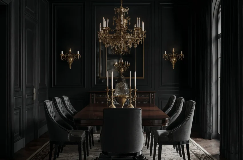
There is a particular kind of restaurant that everyone has been to at least once — the kind where the lighting is low, the walls are dark, the candles are doing most of the work, and every conversation feels slightly more interesting than it would anywhere else. You order things you wouldn’t normally order. You stay longer than you planned. The food tastes better, or at least it seems to. That atmosphere has a name: moody. And there is no reason it has to stay in restaurants.
Moody dining rooms are not dark for the sake of being dark. They are intentional spaces built around atmosphere — around the idea that where you eat shapes how you feel while eating, and how you feel shapes everything else: the quality of the conversation, the pace of the meal, the length of the evening. A well-designed moody dining room makes Tuesday night dinner feel like a dinner party, and dinner parties feel like occasions worth remembering.
This guide covers 20 moody dining room ideas — from deeply dramatic to quietly atmospheric — with practical advice on how to execute each one in a real home. The competitor piece on this topic covers 15 ideas at a surface level. This goes further: into colour psychology, lighting strategy, material choices, and the specific decisions that separate a room that looks dark from a room that genuinely feels moody.
1. Deep Navy Walls with Warm Brass Accents
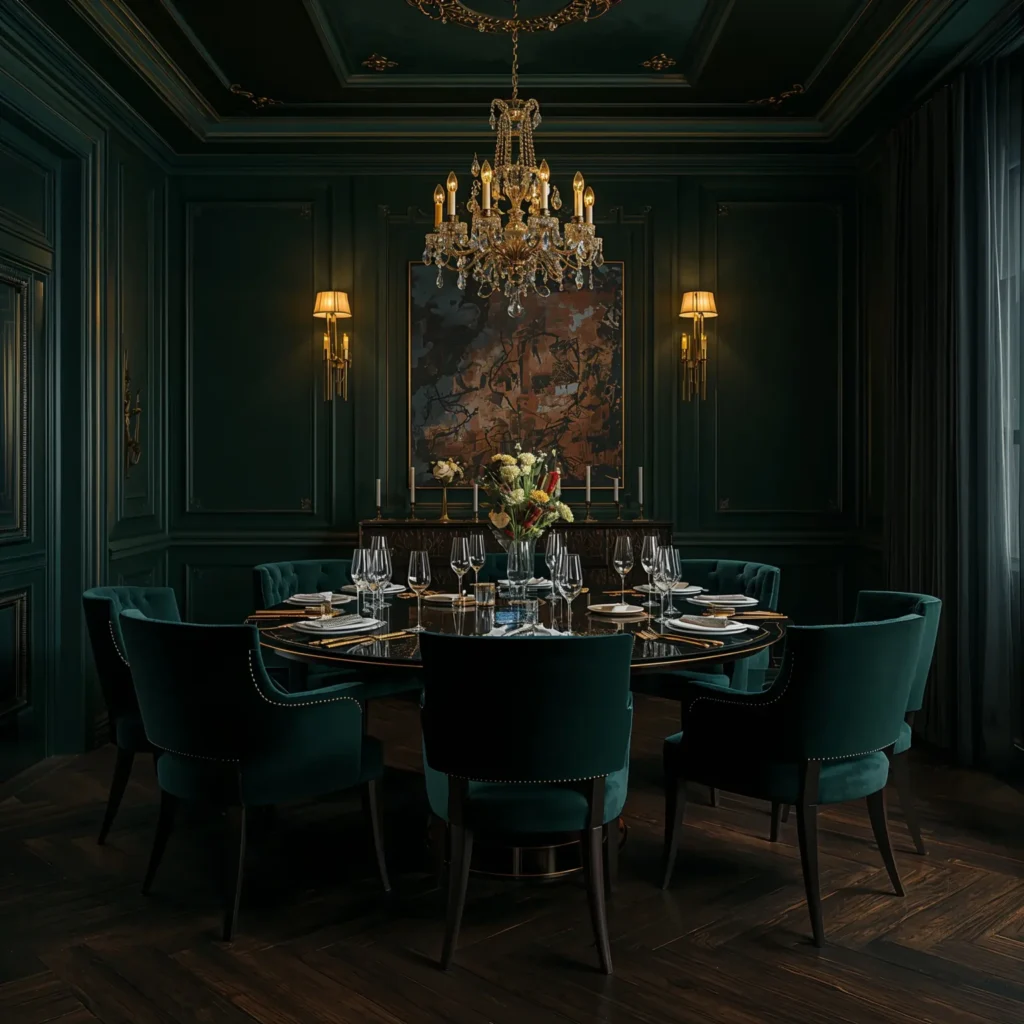
Navy blue is one of the most forgiving colours in interior design, and in a dining room it is particularly effective. It reads as dark and sophisticated in low light but retains colour richness that pure black cannot offer. The key is pairing navy with warm metals — brass above all others. Brass fixtures, brass-legged chairs, brass candleholders: the warm gold tone pulls the yellow undertones from the navy and creates a combination that is genuinely luxurious without effort.
Keep the table simple — a dark walnut or ebony-stained surface works best — and use linen or cotton napkins in cream or warm white to break up the darkness at table level. The goal is richness, not heaviness.
🕯 Designer Note: Use navy on all four walls rather than as a single feature wall. Full immersion is the whole point of the moody aesthetic — one dark wall with three white walls creates contrast rather than atmosphere.
2. Forest Green with Raw Timber and Candlelight
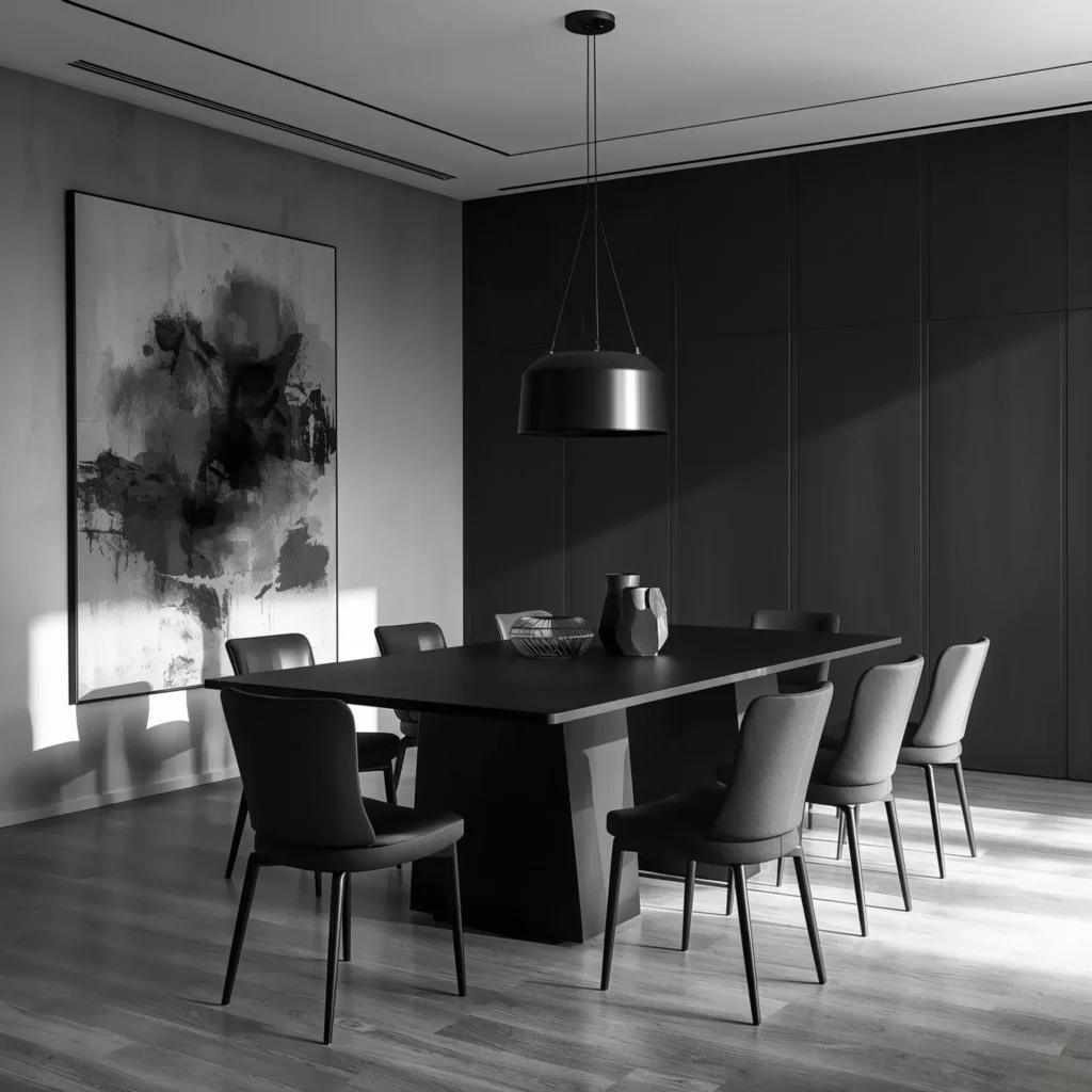
Deep forest green has emerged as the defining colour of contemporary moody dining rooms. It has the warmth that navy sometimes lacks, a connection to the natural world that makes organic materials feel at home, and a depth that changes noticeably between daylight and evening light — appearing almost black by candlelight. It is a colour that rewards the kinds of light a dining room actually uses: warm, directional, low.
Pair forest green walls with raw or lightly finished timber furniture — a solid oak table with visible grain, simple timber chairs with linen seat pads. Add a branch-style chandelier or cage pendant for lighting, and let candles do the rest. The result is a room that feels like a clearing in a forest: elemental and unexpectedly calm.
3. Charcoal and Brushed Brass: The Understated Power Couple
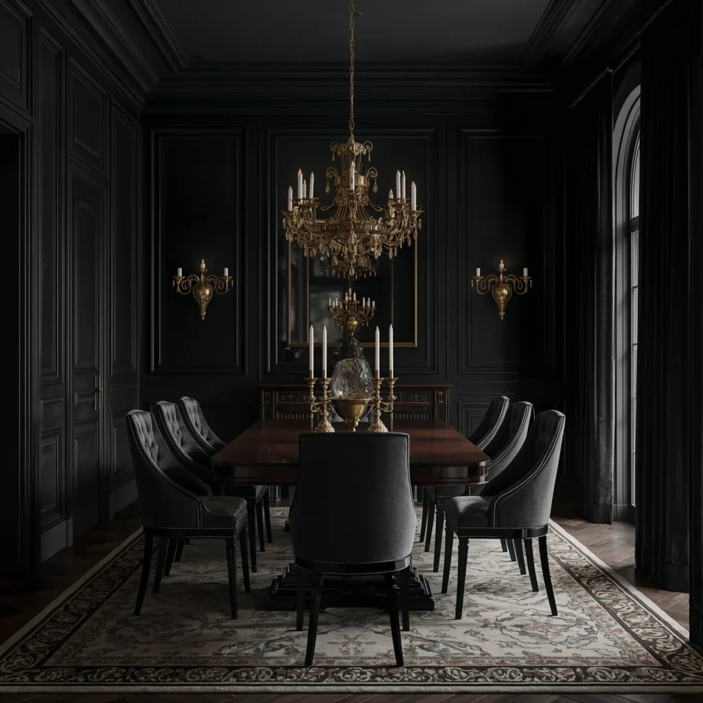
For those who want drama without full commitment to very dark walls, charcoal sits in the ideal middle ground. It reads as definitively dark in most light conditions but holds enough warmth to avoid the coldness of true grey. Charcoal walls with brushed brass fixtures, frames, and hardware create a combination that is simultaneously modern and timeless.
Charcoal works particularly well with textured wallpapers — grasscloth, linen-effect, or concrete-effect papers that add tactile interest to the dark background. Layer in a large framed mirror with a brass or antique gold frame, a table in smoked oak or dark walnut, and dining chairs in deep velvet (forest green, plum, or teal all work beautifully against charcoal).
🕯 Designer Note: When using charcoal walls, the ceiling does not need to be white. A slightly lighter shade of the same grey family on the ceiling — rather than white — keeps the sense of enclosure without adding visual weight to the room.
4. Black Walls, White Plates: The Maximum Contrast Approach
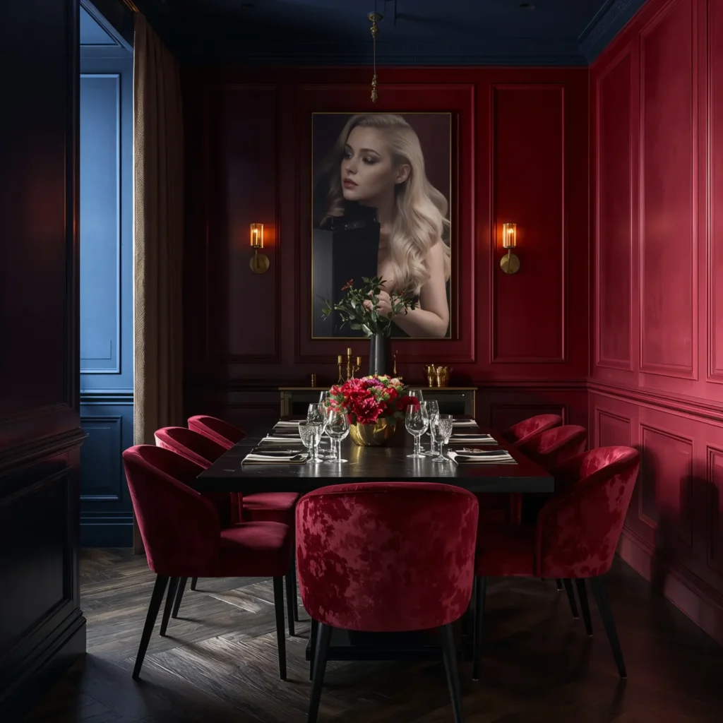
Painting a dining room black remains the most decisive and committed move in the moody design playbook — and it is also, when done correctly, one of the most effective. Black walls do not make a room feel smaller; they dissolve its boundaries. In a room lit primarily by candles and a low pendant fixture, the walls effectively disappear, and what remains is the table, the people at it, and the light.
The trick with black walls is the table setting. White plates on a black table, clear glassware, simple linen napkins, and generous candlelight: this is the combination that makes the whole thing work. The contrast is stark and intentional. Use a matte black paint rather than a satin or gloss finish — the light absorption is much better, and the effect is more sophisticated.
5. Moody Burgundy and Dark Wood: The Victorian Revival
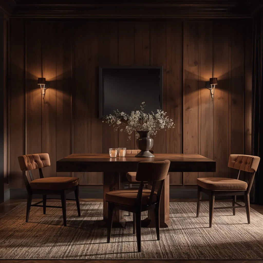
Burgundy — deep wine red with brown undertones — is one of the great underused colours in dining rooms. It is warm where navy is cool, intimate where green can feel remote. A dining room in deep burgundy reads as theatrical and celebratory: the colour of wine, of velvet curtains, of rooms where good things happen.
Pair with dark wood furniture in mahogany, walnut, or ebony tones. Add a statement chandelier in black iron or antique bronze, curtains in a complementary deep tone (forest green or aubergine both work), and upholstered dining chairs in deep velvet. This is a room with a clear point of view — unabashedly romantic and unashamedly dramatic.
6. Inky Blue-Black Walls with Aged Copper Lighting
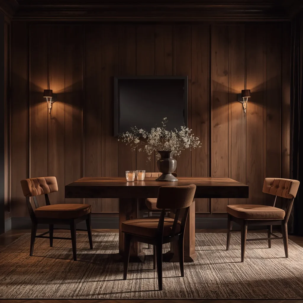
A step darker than navy, blue-black walls achieve something remarkable: they create depth rather than enclosure. The room does not feel boxed in — it feels like it extends beyond its own walls into a deeper space behind them. Aged copper lighting — warm, slightly irregular, with a patina that catches light differently from every angle — is the ideal companion.
Use a single dramatic pendant over the table: a large aged copper dome or industrial cage shade with a visible Edison bulb. Keep the rest of the room quiet — dark furniture, simple table settings, no competing accessories. The lighting is the entire design statement.
🕯 Designer Note: Aged copper is warm where polished chrome is cold. In a moody dining room with blue-black or dark navy walls, polished metallic finishes can look clinical. Aged, brushed, or patinated metals — copper, brass, bronze, iron — always read better against dark backgrounds.
7. The Art Gallery Approach: Dark Walls, Curated Art
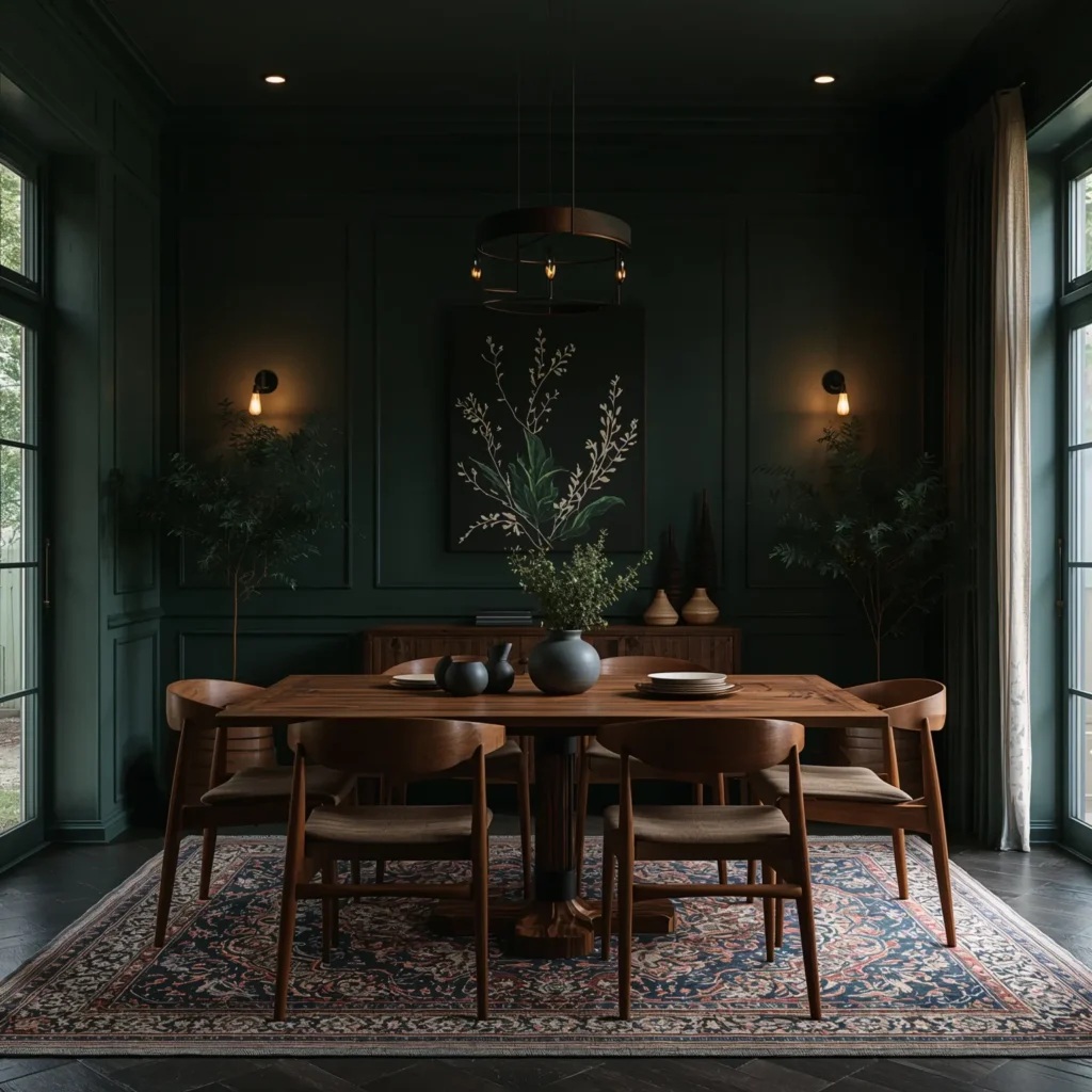
Galleries know something that most homeowners have not yet applied at home: dark wall colours make art look significantly better than white walls do. The contrast increases, the artwork commands more attention, and the overall effect is of deliberate curation rather than accumulated objects.
Choose a deep colour — charcoal, forest green, or navy — and then treat one or more walls as a gallery. Mix frame finishes (all black, all brass, or deliberately mixed but within a tight palette). Include different scales — one large anchor piece with smaller works arranged around it. Use directed picture lighting rather than relying on general room illumination. The result is a dining room that gives guests something to look at throughout the meal, turning the walls into an ongoing conversation.
8. Deep Jewel Tones: Emerald, Sapphire, and Amethyst
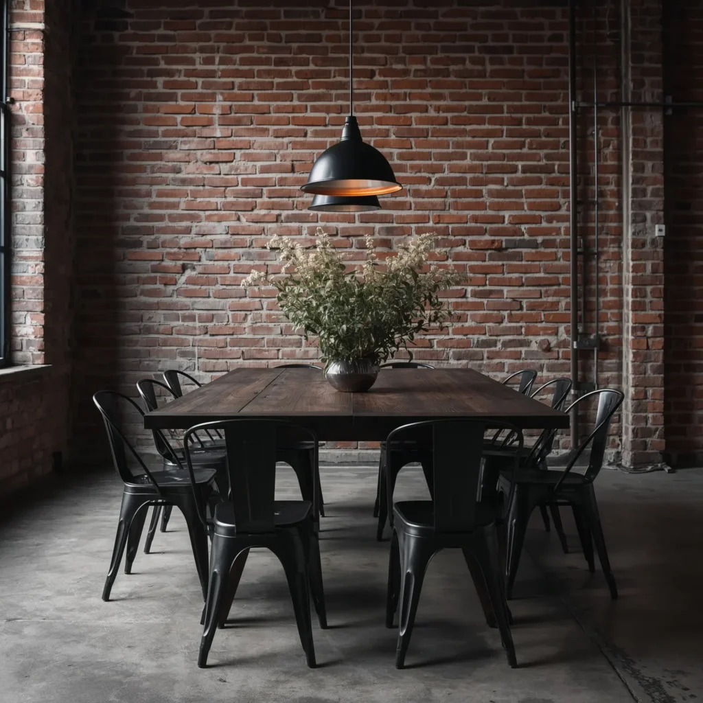
Jewel tones — the saturated, gem-inspired colours that dominated high-end interiors for much of the 2020s — are particularly effective in dining rooms because they are inherently celebratory. Emerald green, sapphire blue, and amethyst purple all create an immediate sense of occasion that neutral palettes cannot match.
The most effective jewel-tone dining rooms use a single dominant colour and then layer tonal variations of it rather than mixing jewel tones together. Emerald walls with teal velvet chairs and gold accents; sapphire walls with indigo upholstery and copper fixtures; amethyst walls with plum curtains and antique silver hardware. Each combination creates richness through depth rather than variety.
9. Industrial Moody: Exposed Brick, Dark Steel, and Edison Bulbs
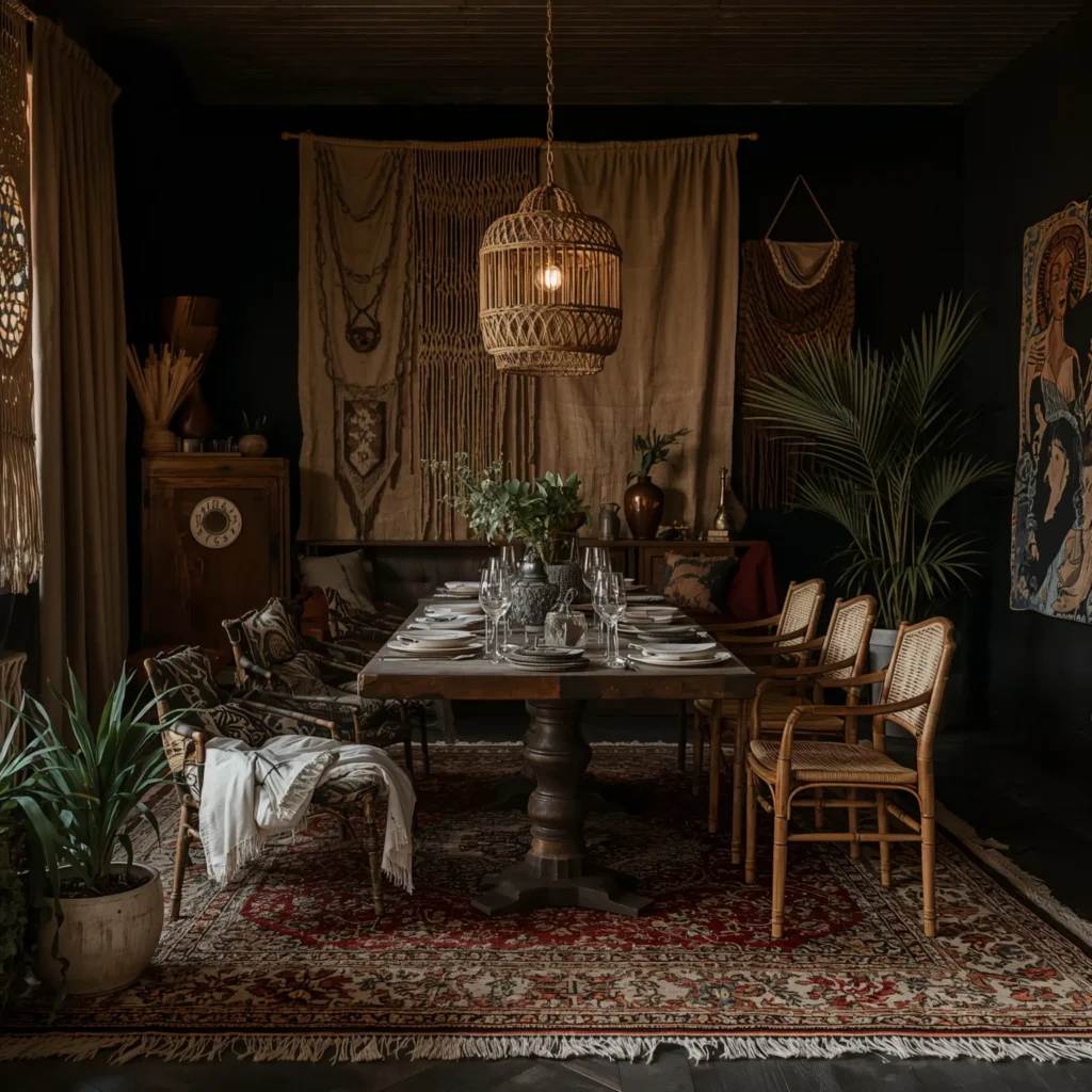
Industrial dining rooms are not inherently moody — bright industrial spaces are their own genre. But industrial materials taken darker, given more warmth, and lit more carefully create something genuinely atmospheric. Exposed brick painted or limewashed in charcoal or dark grey, steel-framed furniture, and Edison bulbs at low wattage: this is the combination.
The key to making industrial moody rather than industrial cold is the introduction of warm textiles. Dark leather dining chairs, a rough linen table runner, heavy cotton or velvet curtains in deep tobacco or forest green. The softness of the textiles reads against the hardness of the industrial materials, and the result is a room that feels intentional rather than unfinished.
🕯 Designer Note: In industrial moody dining rooms, the ceiling is part of the design. If you have exposed beams or ductwork, paint them the same colour as the walls (or darker) rather than leaving them raw metal. This draws them into the composition rather than leaving them looking accidental.
10. Velvet Dining Chairs in Multiple Dark Tones
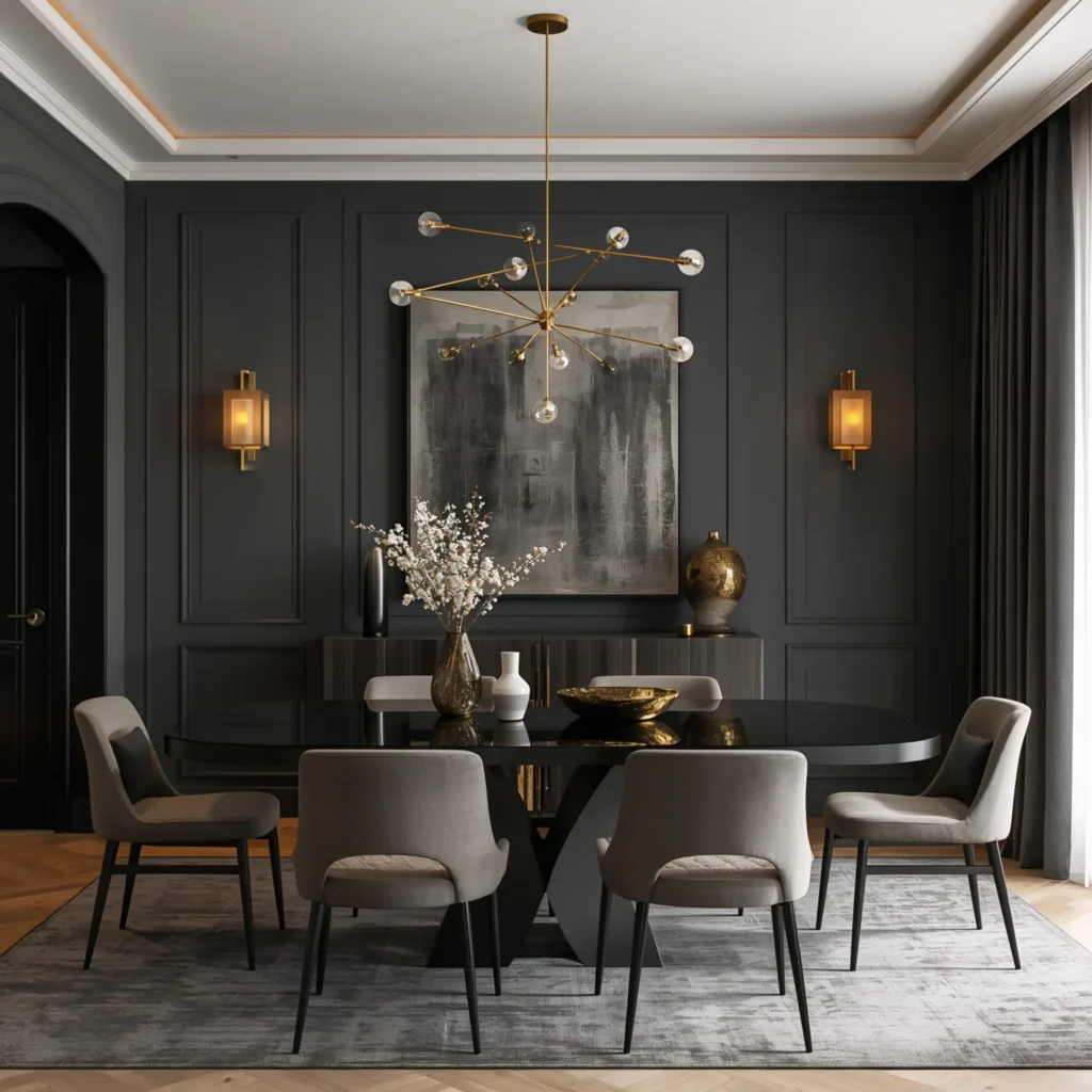
One of the single most effective moves in a moody dining room costs less than a full redecoration: replacing flat, plain dining chairs with velvet upholstered ones in deep tones. Velvet does things in low light that no other fabric does — it absorbs light in some angles and shimmers in others, creating an almost liquid quality that is simultaneously rich and restful.
Mix velvet tones deliberately rather than matching them identically. Forest green and deep teal. Midnight blue and aubergine. Burgundy and burnt orange. The variation adds depth and avoids the showroom-set look that matching chairs can create. Pair with a round table for the most intimate configuration, or a long rectangular table with high-backed velvet chairs at each end for something more formal and theatrical.
11. Candlelight as a Design Material
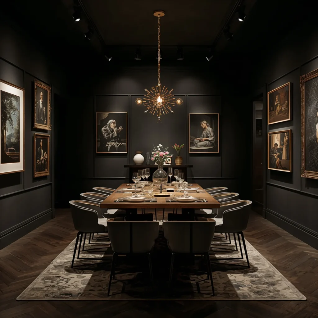
Most homes treat candles as accessories. In a genuinely moody dining room, candlelight is a primary light source — one of the main tools by which the atmosphere is created. This requires thinking about candle placement systematically rather than decoratively.
Place candles at three heights: tall candlesticks at the ends of the table, medium votives or pillar candles down the centre, and low tea lights in glass vessels scattered between. Use candles of a single colour — ivory or cream — to avoid the look of a birthday party. Choose holders in brass, aged bronze, or black iron rather than glass alone. The light produced by this layered candle arrangement is unlike anything an electric fixture can replicate: warm, moving, and uniquely flattering to both faces and food.
12. Dark Floral Wallpaper: Pattern with Depth
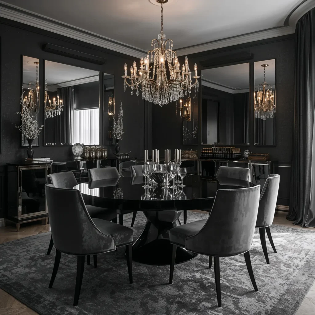
Floral wallpaper in a moody dining room is nothing like the florals of a country kitchen or a traditional bedroom. Moody florals use dark backgrounds — midnight blue, forest green, near-black — with large-scale botanical or floral designs in deep, saturated colours. The effect is of looking at flowers through low light: rich and intense rather than bright and cheerful.
This style of wallpaper tends to work best on all four walls in smaller dining rooms (where it creates the effect of an immersive environment) or on a single dramatic wall in a larger room. Keep everything else quiet: dark or natural furniture, simple table settings, minimal accessories. The wallpaper is the room.
🕯 Designer Note: When pairing dark floral wallpaper with lighting, avoid downlights or bright pendants that wash the pattern out. Side lighting — from wall sconces, table lamps on a sideboard, or directional spotlights — draws out the depth of the pattern far more effectively.
13. The Cocoon Effect: Dark Ceiling Included
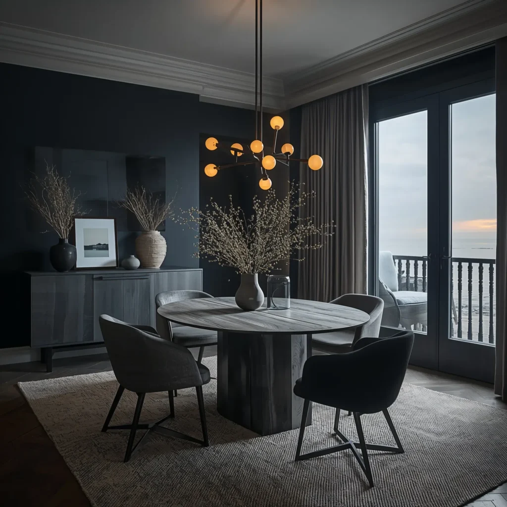
The most committed and architecturally complete version of the moody dining room extends the dark colour to the ceiling. This is the approach that transforms a room with dark walls into something genuinely different: a space that feels built around the table, as though the room itself has contracted to the scale of the gathering.
A dark ceiling dramatically lowers the apparent height of the room — which in a dining context creates intimacy rather than claustrophobia. Pair with a low-hanging pendant fixture (hung lower than you might normally, around 28–32 inches above the table rather than the standard 30–36), keep the table surface light-coloured or reflective, and use generous candlelight. The result is a room in which the table and the people around it are the lit space — everything else recedes.
14. Chinoiserie or Mural Wallpaper in Deep Tones
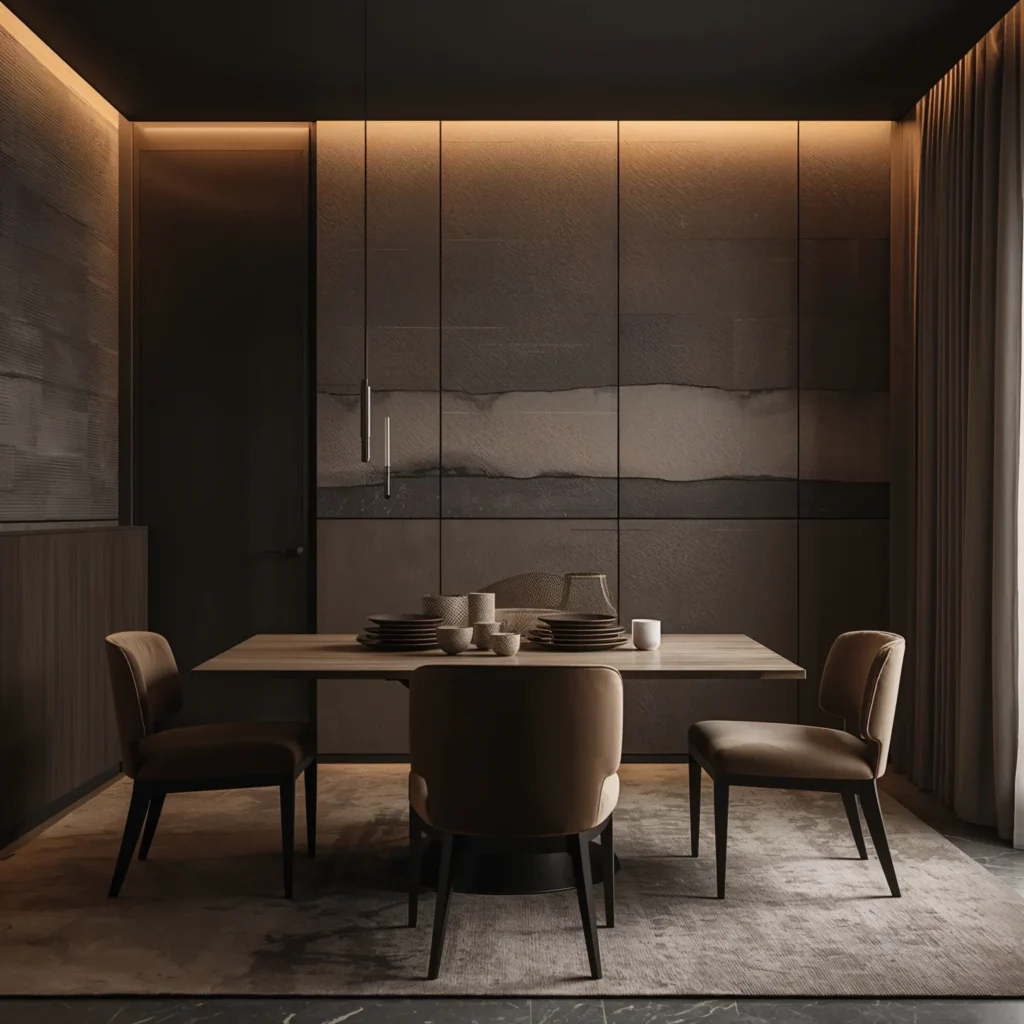
A hand-painted or high-quality printed chinoiserie wallpaper — that Western interpretation of Asian decorative motifs featuring birds, flowering branches, pagodas, and dreamlike landscapes — on a dark indigo, black, or forest green ground creates one of the most sophisticated dining rooms imaginable. The intricate scene on the walls means that no other art or accessories are needed: the room has narrative built into its very surfaces.
Similarly, a scenic mural wallpaper — a moonlit landscape, an abstract forest, a stormy sky — applied to one or all walls achieves the same effect. These are not backgrounds; they are the room. Keep the furniture as quiet and restrained as possible, and let the walls do everything.
15. Dark Timber Panelling: Texture Over Colour
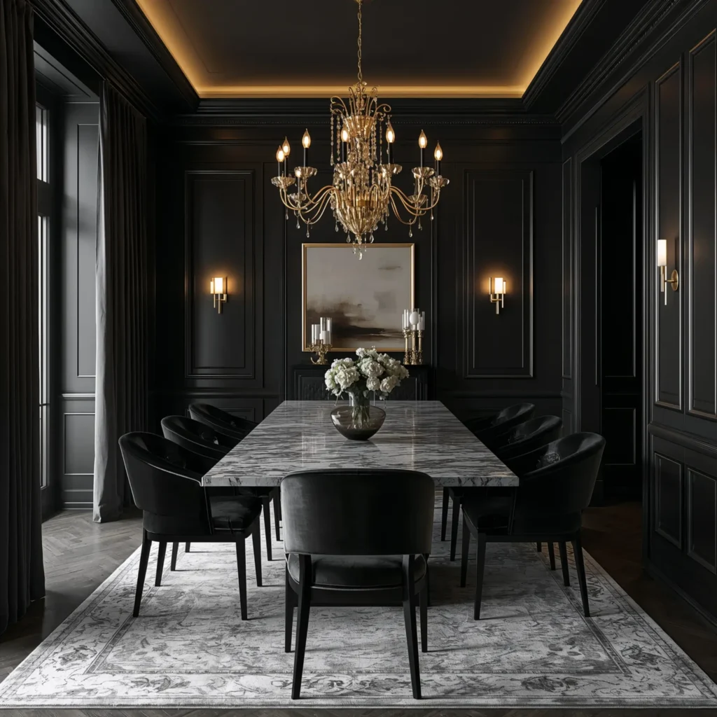
For those who want the depth and richness of dark walls without the commitment of paint or wallpaper, timber panelling in a dark finish offers an alternative that adds texture as well as colour. Dark-stained wall panelling — whether full-height or dado-height — brings a warmth and materiality that paint alone cannot replicate.
Ebony-stained oak, dark walnut panelling, or even painted MDF panelling in a very deep green or charcoal can all achieve the effect. The shadow that falls in the reveals between panels adds an additional layer of visual depth. Pair with contrasting upholstery — a warm tone against the dark wood — and brass or copper hardware throughout.
🕯 Designer Note: Dark panelling works particularly well in dining rooms that receive good natural light during the day. In daylight the room feels rich and layered; in the evening, with candles lit, it transforms into something genuinely extraordinary.
How to Build the Mood: A Practical Room-by-Room Approach
Start with Colour: Choosing Your Dark Foundation
The colour decision is the most important one you will make. Consider three things when choosing:
1. How does the room receive light? South-facing rooms with generous daylight can support very deep colours without feeling dark during the day. North-facing rooms may feel heavy with the darkest colours — consider deep teal or forest green rather than black or near-black.
2. What is the room used for? A formal dining room used primarily in the evenings can carry the most dramatic choices. A family eat-in kitchen used throughout the day needs a colour that works in bright conditions as well as dim ones.
3. What existing elements are you keeping? If your flooring is light oak or pale stone, very dark walls will create strong contrast — which can be effective but requires deliberate management. If your floor is dark, all-over darkness needs very careful lighting to avoid the room feeling oppressive.
Layer Your Lighting
Lighting in a moody dining room must be layered. A single central pendant — even a beautiful one — does not create atmosphere on its own. Combine:
1. A statement pendant or chandelier hung lower than standard (28–34 inches above the table) as the primary light source.
2. Wall sconces on at least one wall, at eye level when seated, for side lighting that picks up the texture of walls and soft furnishings.
3. A sideboard or buffet lamp if you have surface space — this adds a third height of light and creates a warm pool away from the table.
4. Candles at the table, always, for the quality of light that no electrical source can replicate.
5. Dimmers on every circuit so the overall level can be adjusted through the course of the meal.
Choose Materials with the Lighting in Mind
Moody rooms rely on materials that interact well with warm, low light. In practice this means:
1. Velvet for upholstery — its pile creates light and shadow variation that flat fabrics do not.
2. Warm metals — brass, copper, bronze, aged iron — rather than cool chrome or brushed steel.
3. Natural wood with visible grain, ideally in a darker or oiled finish that deepens with candlelight.
4. Linen or cotton for table settings and curtains — these absorb light rather than reflecting it, which suits the atmospheric intention.
5. Stone or concrete for table surfaces or flooring, if the budget allows — these materials have a quality in low light that manufactured surfaces rarely match.
🕯 Designer Note: Avoid high-gloss painted furniture and shiny synthetic fabrics in a moody dining room. They catch light in ways that interrupt the atmosphere rather than contributing to it. The exception is glassware and mirrors, where reflectivity is deliberately used as a contrast element.
Quick Colour Reference: The Best Moody Dining Room Shades
These are the colours that consistently deliver in moody dining rooms, across a range of styles and settings:
1. Hague Blue (Farrow & Ball) / Naval (Sherwin-Williams): the definitive deep navy. Works in almost every lighting condition.
2. Studio Green (Farrow & Ball) / Aged Sage (Benjamin Moore): a forest green with enough depth to read as moody in most light but enough green to feel living and organic.
3. Railings (Farrow & Ball) / Iron Ore (Sherwin-Williams): near-black with a warm dark grey quality. The most versatile very-dark colour.
4. Pelt (Farrow & Ball) / Plum Perfect (Benjamin Moore): a deep aubergine-purple that reads as almost dark grey in low light but reveals its richness in direct illumination.
5. Preference Red (Benjamin Moore) / Rectory Red (Farrow & Ball): the great moody reds — warm, rich, and completely flattering in candlelight.
6. Pitch Black (Farrow & Ball) / Tricorn Black (Sherwin-Williams): for those going all the way. True blacks that work on walls, ceilings, and trim alike.
Frequently Asked Questions
Will a dark dining room make the space feel smaller?
Not necessarily — and often the opposite. Dark colours dissolve the apparent boundaries of a room rather than tightening them. The key is lighting: a dark room with good layered lighting feels intimate rather than small. A dark room with a single bright overhead light will feel cramped. Get the lighting right, and dark walls expand perceived space rather than contracting it.
What colours work best for a moody dining room?
Deep navy, forest green, charcoal, burgundy, and near-black are the core palette. All of these have warmth (either inherent or brought out by warm artificial light), which prevents them from reading as cold or clinical. Cool dark colours — blue-grey, cool concrete grey, lavender-influenced dark — require more careful lighting management to feel atmospheric rather than simply dim.
How do I make a moody dining room work in a small space?
Go all-in with the dark colour rather than using it as an accent. In small rooms, a single dark accent wall with three lighter walls creates contrast rather than atmosphere. Full dark immersion on all four walls (and ideally the ceiling) makes a small room feel intentional and cocooning rather than cramped. Then invest heavily in lighting: more sources, warmer temperature, always dimmable.
Is moody style suitable for a family dining room?
Yes, with practical adjustments. Choose wipeable paint finishes (eggshell or satin rather than flat matte on walls that take knocks and splashes). Use vinyl-coated dark wallpaper rather than pure paper if you are going that route. Select dining chairs in velvet that has been treated with a stain protector. The atmosphere of a moody room has no age restriction — children respond to beautiful spaces as intuitively as adults do.
What lighting temperature should I use in a moody dining room?
2700K or below for all electric light sources. This is the warm white range — the colour temperature closest to incandescent bulbs and candles. Anything above 3000K begins to read as cool white, which destroys the warmth that dark colours require to feel atmospheric rather than cold. Candles burn at approximately 1800–2000K, which is why they are irreplaceable in this context.
Final Thoughts: The Case for Committing to the Mood
There is a version of every redecorating project that holds back — that hedges its bets, leaves a few walls light, uses the dark colour as an accent rather than a statement. This version is also the version that fails to achieve what it set out to do, because atmosphere is not achieved through hesitation.
The moody dining rooms that actually work are the ones where someone decided, committed, and followed through. They painted all four walls the colour they loved. They hung the pendant lower than felt safe. They lit the candles and turned the overheads right down and sat with the result for long enough to understand what it was offering.
What it offers is this: meals that feel like occasions, conversations that feel more worth having, evenings that stretch without anyone noticing. The table has not changed. The food has not changed. But the room has, and the room changes everything.
Take the idea from this guide that resonates most strongly — the one that made you stop and think “yes, that” — and pursue it with the full commitment it deserves. Order the paint samples, live with them for a week, and then go. Your dining room is waiting to become the most interesting room in the house.
✦ ✦ ✦
1 thought on “15 Gorgeous Moody Dining Room Ideas for Cozy Evenings”