
Off white sits in a place that pure white never quite reaches: warm enough to feel inviting, bright enough to feel fresh, and sophisticated enough to make every other element in the kitchen look better. It’s the cabinet color that interior designers reach for when they want a kitchen to feel genuinely beautiful rather than just technically correct.
Pure white has its defenders, and rightly so. But it carries risks: it can read as cold in kitchens with limited natural light, it clashes easily with warm wood tones, and it makes small errors in color coordination look worse than they are. Off white sidesteps all of these problems. Its warmth — whether that comes from cream, ivory, linen, or slightly greige undertones — creates a natural harmony with almost every countertop material, flooring type, and hardware finish you might pair it with.
The challenge is that “off white” is not one color. It’s a category containing dozens of distinct shades, each with a different undertone, a different warmth level, and a different ideal context. Cream leans warm and vintage. Linen reads cool and relaxed. Ivory sits somewhere in between. Greige off-whites feel modern and grounded. Choosing the right one — and pairing it thoughtfully — is what separates a kitchen that looks polished from one that looks slightly off despite everyone’s best efforts.
This guide covers 15 distinct off white kitchen cabinet ideas, each one described with enough specificity to be genuinely useful. Whether you’re planning a complete renovation, replacing cabinet doors, or just deciding on a paint color for the weekend, there’s something in these pages that was designed for your kitchen.
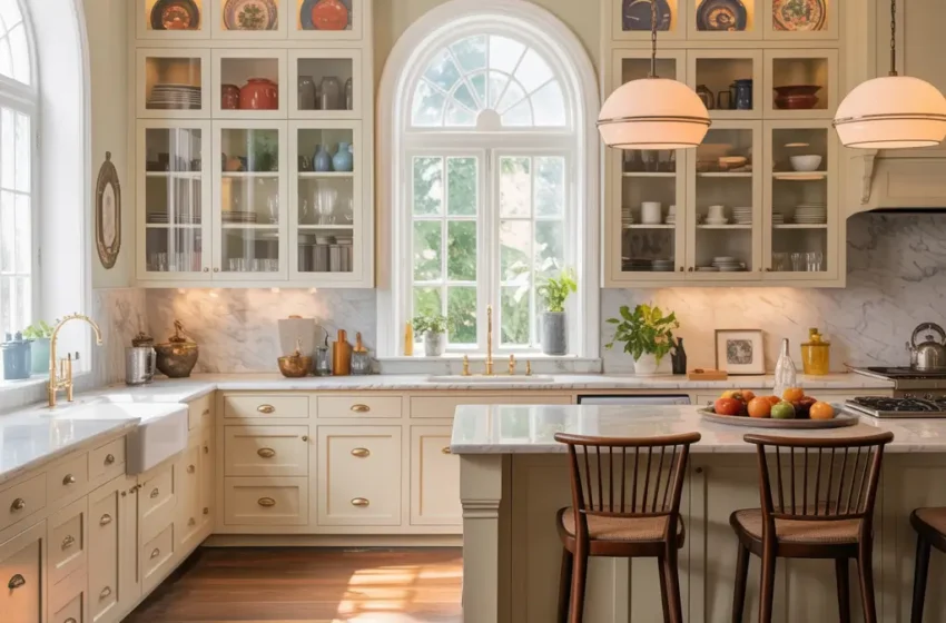
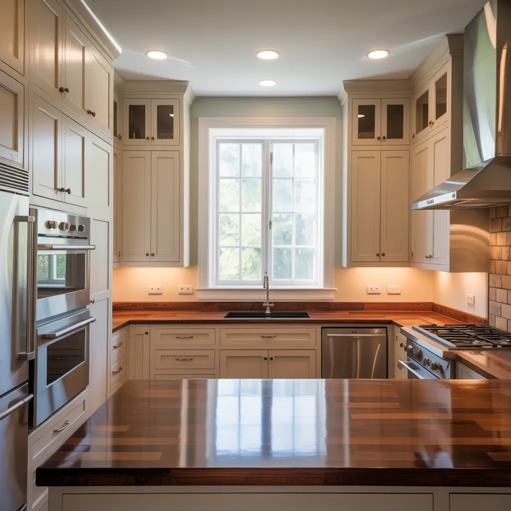
1. Off White Shaker Cabinets with Marble Countertops
This is the pairing that consistently earns its place on design shortlists, and it earns it because the combination is nearly impossible to get wrong. Off white shaker cabinets have enough warmth to soften the cool tones in marble without competing with the stone’s natural beauty, and the simple geometry of the shaker door profile keeps the focus exactly where it should be: on the marble.
Carrara marble with its soft grey veining on a white background pairs particularly well with creamy or ivory off whites. Calacatta, with bolder veining and a warmer background, works beautifully with linen or greige off whites that have a slightly more contemporary quality. The key is matching the warmth level of your off white to the warmth level of the stone — they should feel like they belong together, not like they’re politely tolerating each other.
A honed marble finish rather than polished creates a softer, more matte quality that harmonizes especially well with painted off white cabinetry. Both surfaces share a certain quietness that gives the kitchen a calm, collected feeling.
What Makes It Work:
- Off white shaker cabinet doors — cream or ivory for warm marble, linen for cooler Calacatta
- Carrara, Calacatta, or Statuario marble countertops in honed or polished finish
- Undermount sink in white porcelain for a clean, uninterrupted counter line
- Polished nickel or brushed chrome hardware to keep the palette fresh
- White or very soft grey subway tile backsplash that doesn’t compete with the stone
- Natural light maximized to let the marble’s veining read clearly
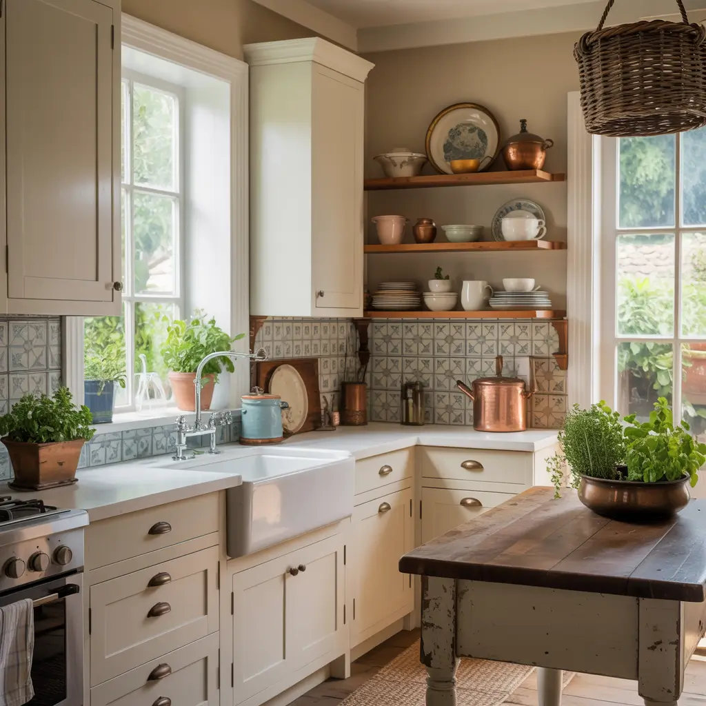
2. Farmhouse Kitchen with Off White Cabinets and Wood Accents
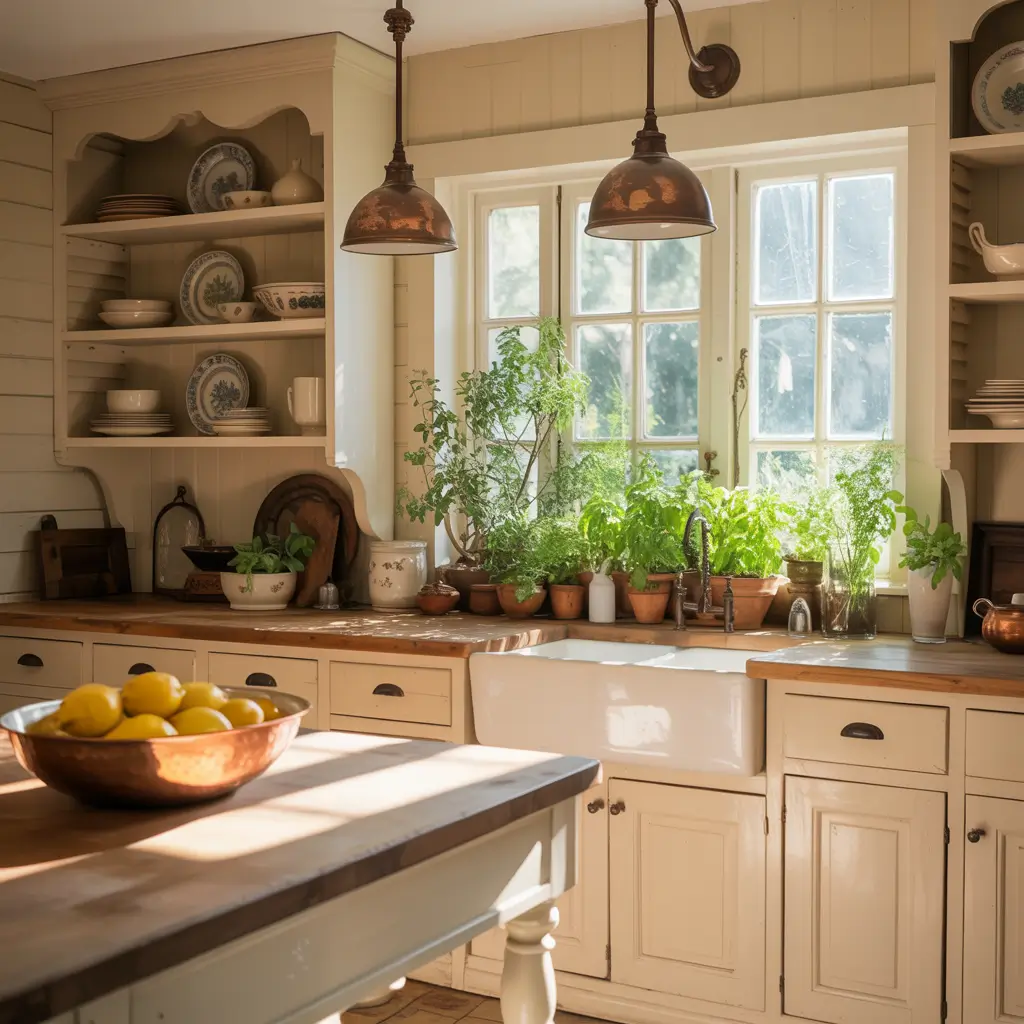
The farmhouse kitchen has proven its staying power, and off white is arguably the color most responsible for making it work as well as it does. Where pure white in a farmhouse kitchen can feel like a stage set, off white feels like the real thing — a kitchen that has been lived in, loved, and gradually refined over years.
An ivory or cream off white on shaker cabinet doors, paired with a white apron-front sink and butcher block countertops, is the farmhouse kitchen at its most honest and appealing. The wood of the butcher block introduces the organic warmth that off white invites, and the two together create a kitchen that feels nutritive in the most literal sense — a place where things are grown, prepared, and shared.
Add open wood shelves above the stove for displaying everyday items, oil-rubbed bronze hardware throughout, and a simple shiplap or beadboard backsplash painted to match the cabinets for a seamless, cohesive look.
What Makes It Work:
- Cream or ivory off white shaker cabinets — warm and slightly aged in feeling
- White apron-front farmhouse sink in fireclay or porcelain
- Butcher block countertops or a butcher block island section
- Oil-rubbed bronze or aged iron hardware throughout
- Open wood shelves above the stove for display and storage
- Beadboard or shiplap backsplash painted to match the cabinet color
3. Modern Off White Cabinets with Matte Black Hardware
Matte black hardware on off white cabinets is one of those combinations that feels like it shouldn’t work on paper but looks extraordinary in practice. The contrast between the soft warmth of off white and the clean hardness of matte black creates a kitchen that feels considered and modern without sacrificing any of the warmth that makes off white so appealing.
For this look, the off white should lean toward linen or a slightly greige tone rather than cream or ivory — a warmer, more yellow off white can make the matte black feel harsh. A cool-leaning off white with grey undertones is the ideal partner. Flat-panel or simple shaker doors keep the visual profile clean, letting the hardware contrast do the talking rather than the door detail.
Extend the matte black through the faucet, light fixtures, and window frame where possible. When a hardware finish appears consistently throughout a kitchen, it reads as a design decision; isolated, it looks like an afterthought.
What Makes It Work:
- Linen or greige-toned off white cabinet doors — flat panel or simple shaker
- Matte black cabinet pulls and knobs throughout
- Matte black faucet and sink hardware
- White or light grey quartz countertops for contrast
- Matte black pendant lights over the island
- White tile backsplash without competing pattern
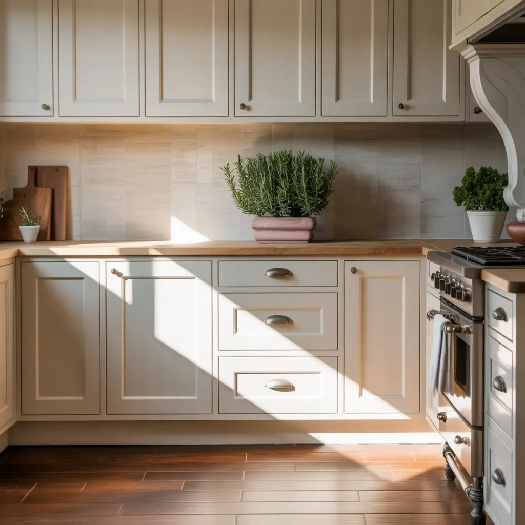
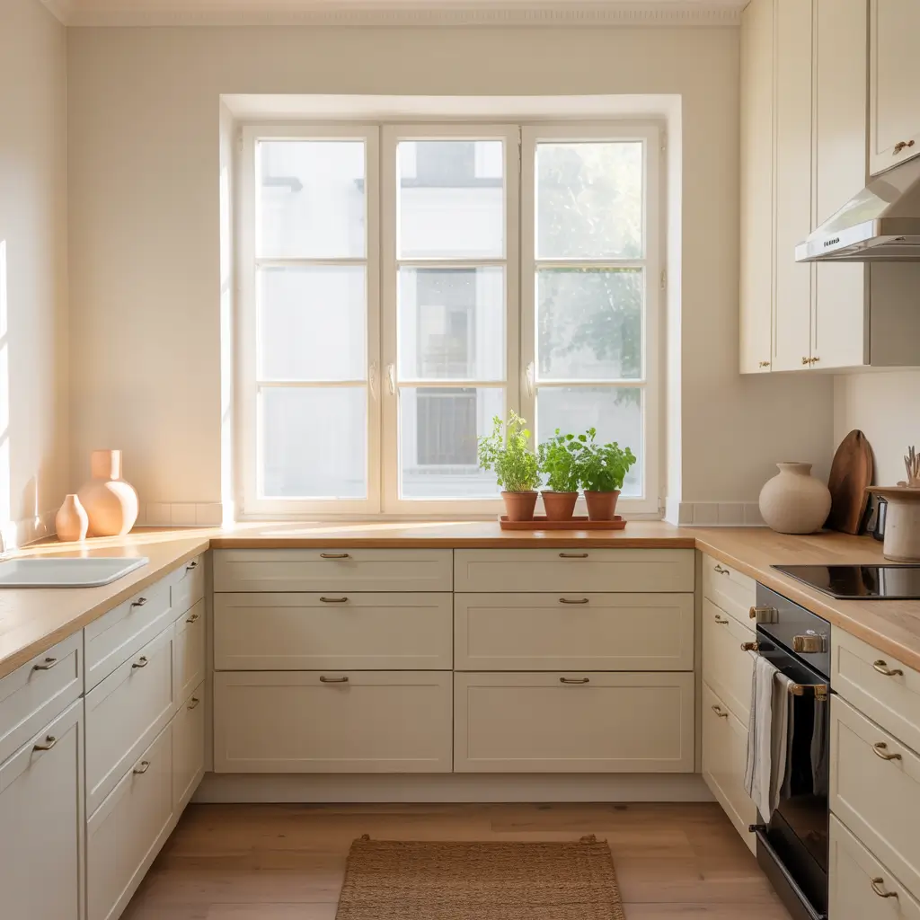
4. Off White Cabinets with Warm Wood Floors
There is something almost elemental about the combination of off white cabinets and warm wood floors. The wood grounds the kitchen with natural warmth and texture while the off white keeps the upper portion of the room feeling light and open. It’s the kind of combination that works in a ten-foot galley and a twenty-foot open-plan kitchen with equal success.
White oak in a natural or warm stain is the current gold standard for this pairing: it complements off white cabinetry without competing with it, and its variation in grain adds visual interest at floor level without distracting from what’s happening above. Honey-toned oak, hickory, and wide-plank pine all work beautifully as well, each bringing a slightly different personality to the kitchen.
The critical factor is matching the undertone of your off white to the undertone of your floor. Cream or ivory off whites with yellow undertones work harmoniously with golden or honey wood tones. Linen or greige off whites with cooler undertones pair better with grey-stained or lighter wood floors.
What Makes It Work:
- Wide-plank white oak or hickory in a warm natural stain
- Off white cabinet color matched in undertone to the floor’s warmth level
- A natural fiber runner rug at the sink to add softness
- Brass or bronze hardware to reinforce the warm wood tone
- Stone or quartz countertops in a light neutral that bridges floor and cabinet
- Plenty of natural light to let the wood floor read accurately throughout the day
5. Two-Tone Kitchen with Off White Uppers and Warm Grey Lowers
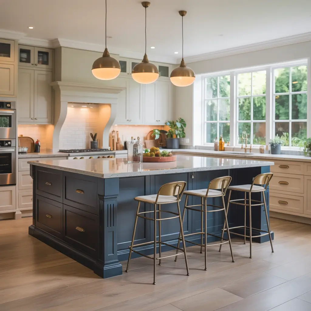
Two-tone cabinetry has become a genuine kitchen design classic, and the off white upper, warm grey lower combination is among its most sophisticated expressions. The off white keeps the upper half of the kitchen feeling light and spacious; the warm grey on the lower cabinets adds depth and visual weight without the darkness or formality of navy or charcoal.
Warm grey is the key qualifier here. A grey with beige or greige undertones will naturally harmonize with the warmth in your off white. A cool blue-grey, by contrast, can create a subtle tension with warm off whites that makes the palette feel slightly uneasy. Greige-grey shades like Agreeable Gray, Accessible Beige, or similar tones from most major paint brands deliver exactly the right quality.
Use the same cabinet door style on both tiers for visual unity. The countertop then acts as the transition between the two tones — a stone or quartz in a neutral cream or light grey that reads harmoniously with both above and below.
What Makes It Work:
- Off white upper cabinets in shaker or flat-panel style
- Warm greige-grey lower cabinets — not cool or blue-inflected
- Consistent hardware finish on both upper and lower cabinets
- Cream or light grey quartz countertop as the visual bridge
- The same cabinet door style on both tiers for cohesion
- A white or soft cream tile backsplash to keep the upper kitchen bright
6. Off White Cabinets in a Small Kitchen
Off white is one of the most effective cabinet colors for small kitchens, and the reason is more nuanced than simply “light colors make spaces feel bigger.” It’s specifically the warmth of off white that does the work: it reflects light generously while preventing the slightly sterile, boxed-in feeling that pure white can produce in a compact kitchen.
In a small kitchen, running off white cabinets all the way to the ceiling is one of the highest-impact moves available. It eliminates the visual break that standard-height upper cabinets create, draws the eye upward, and maximizes storage simultaneously. Pair with a backsplash in the same color family as the cabinets — a warm ivory or cream tile — and the kitchen reads as seamlessly continuous rather than small and choppy.
Glass-front upper cabinets add visual depth in compact kitchens by suggesting space beyond the cabinet door. Keep what’s inside organized and consistent — matching dishware in neutral tones looks beautiful; a jumble of mismatched containers works against the effect entirely.
What Makes It Work:
- Floor-to-ceiling off white cabinets to maximize storage and visual height
- Backsplash in the same warm tone as the cabinets for a seamless look
- Glass-front upper cabinets to add depth without bulk
- Light countertops in white, cream, or very pale grey quartz
- Recessed downlights plus under-cabinet LED strips for maximum brightness
- Minimal hardware or push-to-open mechanisms to reduce visual clutter
7. Off White Cabinets with Quartz Countertops
Quartz countertops and off white cabinets are a practical partnership that happens to also be a beautiful one. Quartz offers the look of stone with none of the maintenance anxiety, and in the wide range of warm white, cream, and ivory tones available, it creates countertops that feel genuinely custom-designed to complement an off white cabinet palette.
The most harmonious pairings match the quartz’s undertone to the cabinet’s undertone. A creamy off white cabinet pairs beautifully with a quartz that has warm ivory or beige veining. A linen-toned off white works with a softer, more neutral quartz with subtle grey movement. The goal is harmony: two elements that feel like they were chosen together, not two separate decisions that happen to occupy the same counter space.
One practical advantage worth noting: quartz with a slightly warm or cream base actually hides everyday kitchen wear — minor staining, water marks, light scratches — far better than stark white quartz, which shows every blemish.
What Makes It Work:
- Warm-toned quartz with cream, ivory, or subtle beige veining
- Quartz undertone matched to the off white cabinet undertone
- Waterfall island edge in the same quartz for a high-end, seamless look
- Undermount sink for a clean, uninterrupted counter surface
- Hardware in a warm metal — brass, bronze, or brushed gold — to complement the warmth
- Backsplash in a neutral tile that bridges cabinet and countertop tones
8. Off White Cabinets with Gold Hardware
Brushed or satin gold hardware is one of the most transformative upgrades available to an off white kitchen, and it costs a fraction of what any structural change would. The warmth of gold picks up and amplifies the warmth in off white cabinetry, creating a sense of intention and luxury that no cooler metal finish quite replicates.
The key distinction is between brushed gold and polished gold. Polished gold can veer into territory that feels dated or excessive; brushed or satin gold has a subtlety and depth that feels genuinely sophisticated. It reads as a considered design choice rather than a flashy one, which is exactly what the warmth of off white cabinets deserves.
Extend the gold finish consistently: cabinet pulls, knobs, faucet, soap dispenser, and pendant lights should all share the same warm metal. When a single finish appears throughout a kitchen, it transforms from an accessory into an architectural detail.
What Makes It Work:
- Brushed or satin gold cabinet pulls and knobs throughout
- Matching gold or warm brass faucet and sink accessories
- Gold-toned pendant lights over the island
- Cream or ivory off white that shares the gold’s warm undertone
- White marble or warm quartz countertops to complement the palette
- No mixing of gold with chrome or nickel — consistent finish throughout
9. Off White Cabinets with Dark Countertops
The contrast between off white cabinets and dark countertops is one of those pairings that feels both timeless and unexpected. Where pure white cabinets against dark countertops can feel stark and modern, off white softens the contrast into something warmer and more interesting — the difference between a high-contrast design statement and a deeply inviting kitchen.
Black soapstone, honed Absolute Black granite, or a deep charcoal quartzite all make exceptional partners for off white cabinetry. The warmth of the off white prevents the dark countertop from feeling oppressive, while the dark countertop gives the kitchen a grounded, anchored quality that very light kitchens sometimes lack.
Pull the dark tone through in your hardware — matte black or dark bronze both work — and keep the backsplash light to prevent the kitchen from tipping too dark. Under-cabinet lighting is particularly important in this configuration: it keeps the work surface bright and prevents the contrast between light cabinets and dark counter from feeling dramatic rather than elegant.
What Makes It Work:
- Off white shaker or flat-panel cabinets — cream or ivory tone
- Black soapstone, honed black granite, or dark charcoal quartzite countertops
- Matte black or dark bronze hardware to echo the dark countertop
- White or cream tile backsplash to keep the upper kitchen bright
- Under-cabinet lighting — essential for keeping the workspace functional
- Light flooring in wood or tile to balance the dark counter
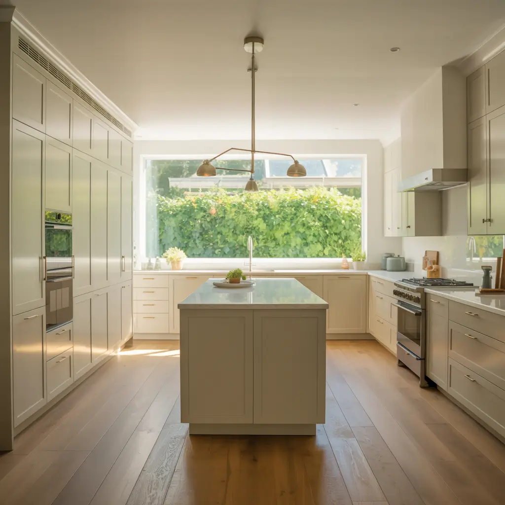
10. Transitional Kitchen with Off White Cabinets
Transitional design — the style that bridges traditional architecture and contemporary sensibility — is arguably where off white cabinets feel most naturally at home. Off white is neither old-fashioned nor aggressively modern; it carries warmth and a sense of history without any specific period reference. That makes it the ideal foundation for transitional kitchens that want to feel both current and enduring.
Shaker cabinet doors are the classic transitional choice: more architectural detail than flat slab, less ornament than raised panel. Off white shaker cabinets with quartz countertops, brushed nickel hardware, and a simple tile backsplash in a neutral pattern creates a kitchen that is simultaneously comfortable and refined — the transitional ideal.
For a kitchen that will still look beautiful in fifteen years, this combination is one of the safest and most rewarding choices available. It’s not immune to time, but it ages gracefully rather than dating abruptly.
What Makes It Work:
- Off white shaker cabinet doors — the transitional door style par excellence
- Quartz countertops in white or warm cream
- Brushed nickel or chrome hardware throughout
- Stainless steel or panel-ready appliances
- A neutral tile backsplash in a classic pattern — subway, square, or simple mosaic
- Clean-lined pendant lights that read as neither industrial nor ornate
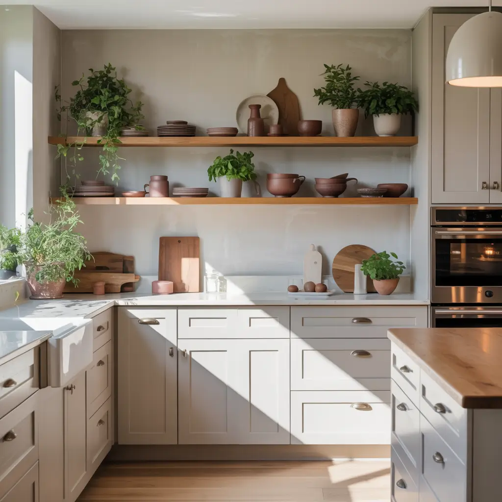
11. Off White Cabinets with Open Shelving
Replacing some upper cabinet doors with open shelving is one of the most impactful and relatively affordable ways to change the feeling of a kitchen. Against off white lower cabinets and walls, open shelves — in natural wood, painted to match, or in a contrasting material — introduce lightness, texture, and a curated quality that closed cabinetry rarely achieves.
Natural wood shelves in white oak or walnut create a beautiful warmth against off white walls and cabinetry. The organic grain of the wood provides visual texture that the smooth surface of painted cabinets lacks, and it creates a layered quality in the kitchen that feels genuinely designed rather than assembled from standard components.
What you display on open shelves is part of the design. In an off white kitchen, cream and white dishware, terracotta pots, small plants, and cookbooks with warm-toned spines all reinforce the palette beautifully. Resist the temptation to use open shelves as overflow storage for things you don’t want to look at — they only work when what’s on them is as considered as the shelves themselves.
What Makes It Work:
- White oak or walnut floating shelves for warmth and organic texture
- A curated, intentional display — not overflow storage
- Cream, white, or terracotta dishware and accessories
- Small plants or fresh herbs for life and natural color
- Brackets in a metal finish consistent with the kitchen hardware
- Under-shelf lighting to illuminate what’s on display
12. Off White Cabinets with a Statement Range Hood
In any kitchen, the range hood is the architectural focal point — the vertical element that anchors the cooking zone and gives the room its strongest sense of design intention. Against off white cabinetry, a statement hood becomes even more impactful because the cabinet color is warm and inviting rather than stark, which draws the eye toward the hood rather than away from it.
A plaster or painted wood hood in a cream or warm white tone — matching or slightly deeper than the cabinet color — creates an elegant, architectural look that feels custom-built even when it isn’t. A natural wood hood adds warmth and character. A dark metal hood in matte black or weathered bronze creates a striking contrast against off white cabinets that becomes the most memorable element in the kitchen.
What Makes It Work:
- A plaster or wood hood in cream or warm white for seamless elegance
- A dark metal hood in matte black or bronze for bold contrast
- Hood size proportional to the range — too small undermines the focal point
- Details on the hood — corbels, molding, insets — that relate to the cabinet style
- Good lighting built into or above the hood for function and ambiance
- Hardware on the hood that matches the cabinet pulls
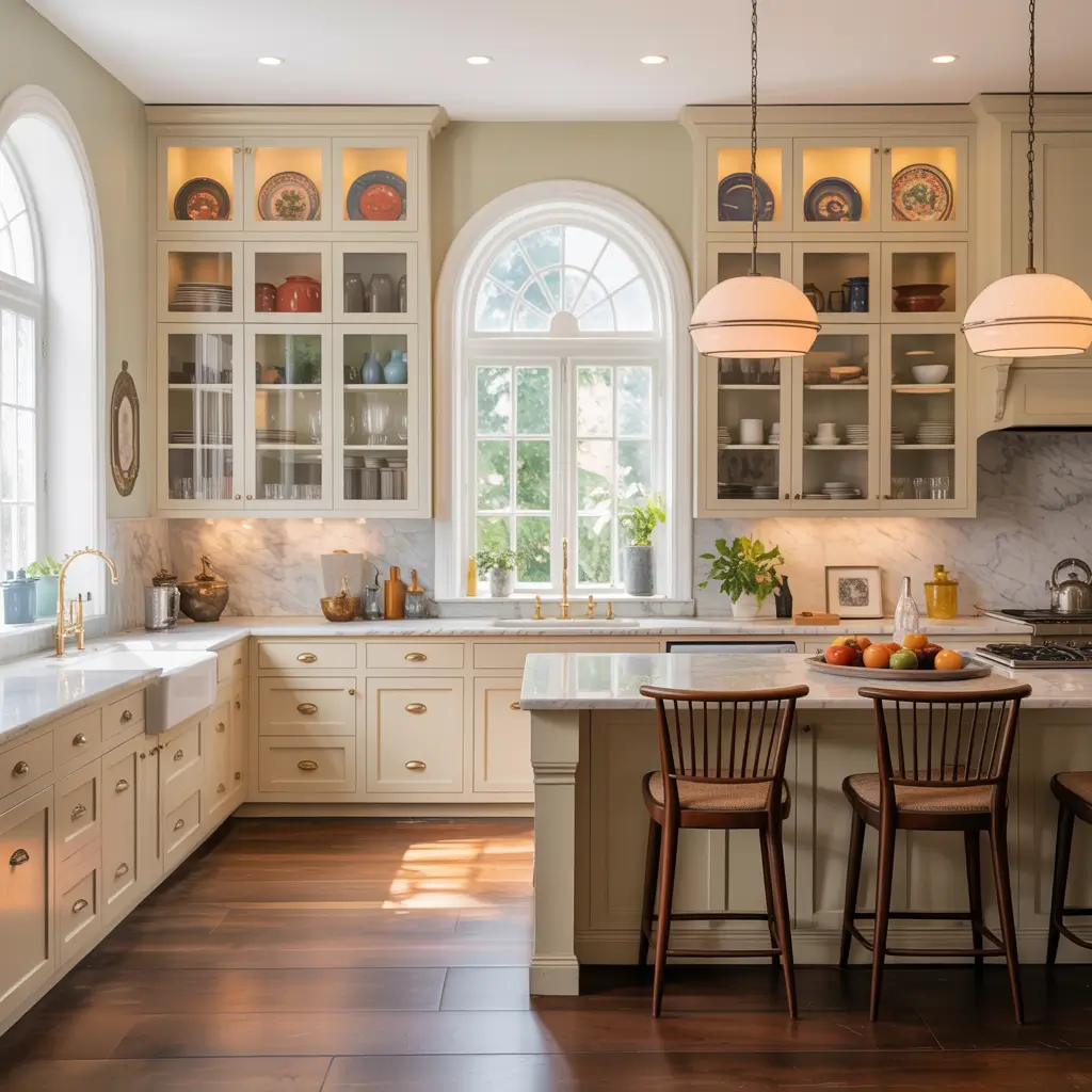
13. Vintage-Inspired Off White Kitchen
Off white carries a natural vintage quality that no other cabinet color can claim with quite the same authenticity. Cream, ivory, and aged white have been the colors of kitchen cabinetry in beautiful homes throughout the twentieth century, and using them thoughtfully today creates a kitchen that feels rooted and considered rather than simply old-fashioned.
For a vintage-inspired kitchen, choose an off white with genuine warmth — cream or ivory, perhaps with a very slight yellow undertone. Pair with glass-front upper cabinets to display vintage dishware, a bridge faucet with porcelain cross handles, beadboard wainscoting or backsplash, and pendant lights with a fabric shade or cage detail that suggests the 1930s or 1940s without being a period reproduction.
Countertops in white or cream with some variation — a honed marble, a textured quartz, or even a butcher block — reinforce the handcrafted quality of vintage design better than a perfectly uniform engineered surface.
What Makes It Work:
- Cream or ivory off white with genuine warmth — not too cool or clinical
- Glass-front upper cabinets for displaying vintage dishware
- Bridge faucet with porcelain handles in a period-appropriate style
- Beadboard or wainscoting painted to match the cabinets
- Vintage-inspired pendant lights with fabric shades or cage details
- Honed marble or butcher block countertops with natural variation
14. Off White Cabinets with a Colorful Kitchen Island
One of the quiet advantages of off white cabinetry is how gracefully it accommodates a contrasting island color. Where pure white perimeter cabinets can make a colored island look jarring or accidental, off white softens the juxtaposition into something that feels warm and intentional. The off white reads as a neutral backdrop; the island reads as the design decision.
Deep sage green is arguably the most popular pairing right now, and it earns its popularity: against a warm off white, sage reads as natural and grounded without being heavy. Navy blue creates a more dramatic contrast. A terracotta or warm rust island against off white perimeter cabinets feels both unexpected and completely right. Dusty blue or slate grey offer more subtle contrast for kitchens where a quieter palette is preferred.
Whatever island color you choose, use the same hardware finish on both the island and the perimeter cabinets for cohesion, and let the countertop on the island either match or meaningfully contrast with the perimeter countertop.
What Makes It Work:
- Off white perimeter cabinets as the warm, neutral backdrop
- Island in sage green, navy, terracotta, or dusty blue for contrast
- Consistent hardware finish on both island and perimeter
- Marble or quartz island countertop in white or cream
- Pendant lights over the island that bridge the two cabinet colors
- The accent color introduced nowhere else — the island is the statement
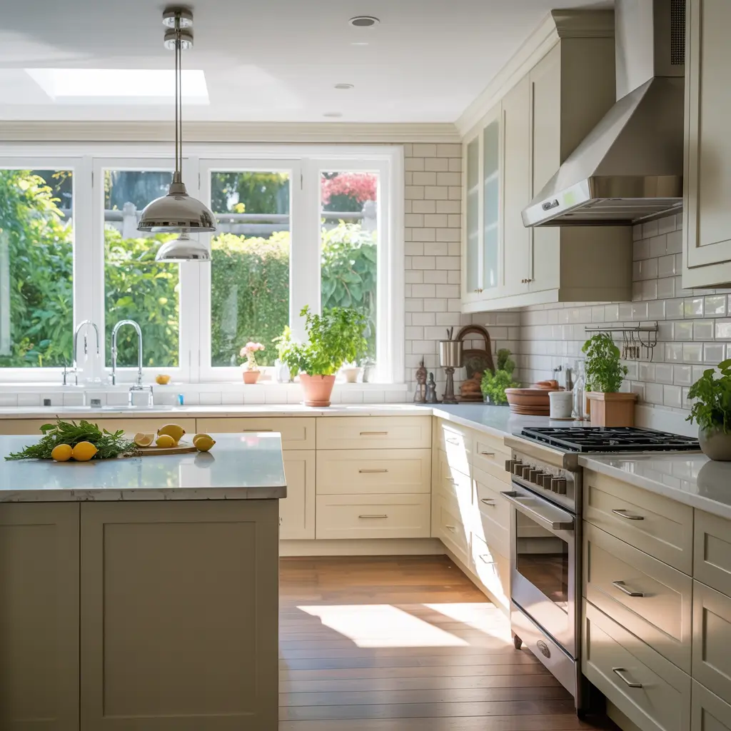
15. Off White Cabinets with a Subway Tile Backsplash
The subway tile backsplash has been a kitchen design standard for more than a century, and it remains one for a reason: nothing else provides the same combination of visual simplicity, textural interest, easy maintenance, and adaptability to almost any kitchen style. Against off white cabinets, subway tile creates a relationship between backsplash and cabinet that feels quiet, integrated, and deeply satisfying.
Classic 3×6 white subway tile with a cream or warm white grout creates a nearly seamless look against off white cabinetry — the grout color bridges the slight warmth difference between tile and cabinet perfectly. For something slightly more interesting, handmade subway tile with natural glaze variation brings a warmth and craft quality that works beautifully in farmhouse or vintage-inspired kitchens.
Grout color is a consequential decision in this pairing. A warm cream grout creates the most seamless, harmonious result. A grey grout adds graphic definition. A dark grout makes a bold modern statement. Each produces a noticeably different kitchen feel from the same tile.
What Makes It Work:
- Classic 3×6 white subway tile in standard or handmade variation
- Cream, warm white, or light grey grout — chosen to match or define the tile lines
- Full height from counter to upper cabinet for a tailored finish
- A herringbone or stacked pattern for more visual interest in a simple kitchen
- Simple cap rail or open shelves at the top of the tile installation
- Backsplash extends behind the range for a complete, finished look
How to Choose the Right Off White for Your Kitchen
Off white sounds simple until you’re standing in front of 40 paint chips that all claim to be cream, ivory, or linen and somehow all look different and all look the same simultaneously. Here’s how to navigate the choice without losing your mind.
Start With Undertones, Not Names
Off white paint names — Antique White, Navajo White, Swiss Coffee, Linen White, Ivory — tell you almost nothing useful. What matters is the undertone. Warm off whites pull yellow, beige, or peachy. Cool off whites pull grey or green. True neutrals sit between the two. Warm undertones feel cozy and traditional; cool undertones feel cleaner and more contemporary. Identify which direction you want before narrowing down specific colors.
Test Against Your Actual Materials
Never choose an off white without testing it against your actual flooring and countertop material. A cream off white that looks beautiful in isolation can look dingy against cool grey stone, or warm and perfect against honey wood floors. Take large paint samples — at least 12 inches square — and hold them against every material in the kitchen before making a decision.
Test in Morning and Evening Light
Off white is particularly light-sensitive. A cream that looks warm and welcoming in morning natural light can look yellow or dingy under warm incandescent bulbs in the evening. Test your shortlisted colors at multiple times of day and under your actual kitchen’s artificial lighting before committing. This single step prevents more off white kitchen mistakes than any other.
Consider the Size of Your Kitchen
Small kitchens benefit from off whites with lighter, slightly cooler undertones that maximize the sense of brightness without going stark white. Large kitchens can handle warmer, deeper off whites — creams and ivories with more warmth — because the space and natural light can absorb the additional warmth without feeling heavy. When in doubt, start lighter than you think you need and adjust from there.
Pro tip: The most reliable test for any off white is to paint a 12-inch square directly on a cabinet door — not just on the wall. Cabinet paint appears slightly different on a door panel than on a flat wall, and you’ll see the true color and how it reads in the space where it actually matters.
Final Thoughts
Off white kitchen cabinets have earned their enduring place in kitchen design not through fashion cycles or trend reports but through the simple, consistent fact of looking beautiful in real kitchens, in real homes, over long periods of time. The 20 ideas in this guide represent the full range of what off white can do — from the rustic authenticity of a farmhouse kitchen to the sophisticated restraint of a matte-finish modern space, from the drama of dark countertop contrast to the quiet harmony of matched stone and cream cabinetry.
What makes off white so reliable as a design choice is not just its beauty but its generosity. It makes other elements look better: the marble countertop looks more luxurious, the wood floor looks warmer, the brass hardware looks richer, the open shelving looks more curated. It is, in the best sense of the word, a supporting player that makes everyone else in the cast perform better.
The right off white for your kitchen is the one that harmonizes with your materials, works beautifully in your light conditions, and creates the feeling — warm, open, inviting, sophisticated — that you want every time you walk in. The ideas in this guide are starting points. The kitchen you create from them is yours.
“The best cabinet color is the one that makes your kitchen feel like home from the first morning. Off white has a remarkable track record of doing exactly that — for decade after decade, in kitchen after kitchen, regardless of style.”
1 thought on “15 Stunning Off White Kitchen Cabinets Ideas and Modern Designs”