
Here’s the thing about white kitchen cabinets: they give you a gift and a problem in the same package. The gift is flexibility. Almost no backsplash material on earth looks wrong against white cabinets. The problem is paralysis. When everything works, how do you choose?
I’ve watched homeowners spend more time selecting a backsplash than they spent choosing their countertops, their flooring, and their appliances combined. The tile store becomes a two-hour ordeal. The sample chips come home and get propped against the cabinet door in seventeen different lighting conditions. The decision that was supposed to take a weekend takes three months.
It’s understandable. The backsplash is the visual heart of the kitchen. It’s the surface that fills the most prominent wall space between countertop and upper cabinet — the zone your eye lands on first when you walk into the room. Get it right and the whole kitchen coheres. Get it wrong and every meal becomes a quiet reminder of the decision you wish you’d made differently.
This guide covers 15 kitchen backsplash ideas for white cabinets — across every style, material, and price point. But more than a list of options, it’s a decision framework. Each idea comes with the design logic behind it, the practical considerations that don’t appear in photography, and the specific details that make the difference between a backsplash that looks good in photos and one that makes your kitchen feel genuinely right to live in.
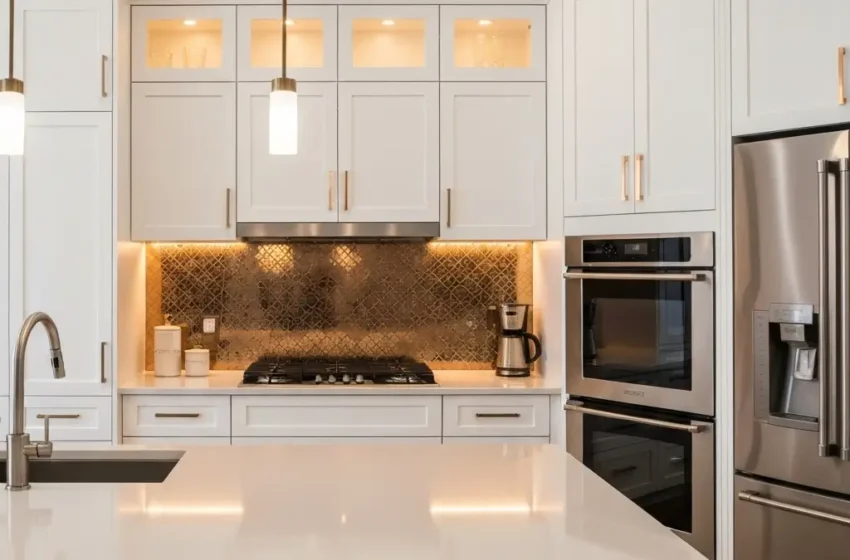
1. Classic White Subway Tile with Dark Grout — The Graphic Workhorse
White subway tile has appeared in kitchens for over a hundred years. It appeared in the original New York City subway stations in 1904, and it has never fully left kitchen design since. The question is no longer whether subway tile works with white cabinets — it demonstrably does — but how to make it feel current rather than default.
The answer is the grout. White subway tile with white or off-white grout creates a near-seamless surface that reads as quiet and clean. White subway tile with charcoal or dark gray grout creates a graphic grid that adds visual energy and definition to the wall without introducing color. That single decision — light grout versus dark grout — produces two genuinely different kitchens from the same material.
Dark grout in a classic 3×6-inch horizontal brick-lay pattern against white shaker cabinets is one of the most consistently successful combinations in kitchen design. It looks intentional without being showy. It photographs beautifully. It hides grime in the grout lines rather than displaying it. And it makes the white cabinets look crisper and more defined by providing a contrasting background that white grout doesn’t.
Subway Tile Layout and Grout Combinations to Consider
- Classic 3×6-inch horizontal brick lay with charcoal grout — the defining combination, modern and timeless
- Vertical stack with white grout — creates height, good for kitchens with lower ceilings
- Herringbone pattern with dark grout — movement and elegance, the most sophisticated subway tile layout
- Mixed-size subway tile (2×4 and 3×6 combined) with consistent grout — visual interest without pattern
- White subway tile with black grout in a 4×4-inch square stack — bolder, more graphic, contemporary
Pro Tip: Grout color selection should be made with a wet sample on your actual tile, not from a dry chip. Grout dries significantly lighter than it appears wet, and the final installed color can be two or three shades lighter than the wet sample. Ask your tile installer to show you a cured sample before committing to a color.
2. Marble Slab Backsplash — The Luxury Statement

A full marble slab backsplash extending from countertop to upper cabinet in a continuous piece is among the most beautiful things you can do to a white kitchen. Not marble tiles. Not marble-look porcelain. A single continuous slab of real marble, ideally book-matched with the countertop material so the veining flows from horizontal surface to vertical surface in an unbroken composition.
The visual effect is genuinely extraordinary. The white cabinets frame the marble the way a white wall frames a painting. The stone’s veining — whether the subtle gray of Carrara, the bold gold and gray of Calacatta, or the dramatic dark veining of Statuario — becomes the entire personality of the kitchen. Nothing else competes. Nothing else needs to.
The practical considerations are real: marble is porous and requires sealing, it can etch from acidic spills (lemon juice, vinegar, tomato sauce), and it will develop a patina over time that many homeowners find beautiful and some find troubling. If you want a kitchen that looks exactly the same at fifteen years as it did on day one, marble is not the right choice. If you want a kitchen that develops the kind of character that only natural materials can accumulate, marble is extraordinary.
Marble Varieties for White Cabinet Backsplashes
- Carrara marble — soft gray veining, the most accessible marble price point, pairs with every white cabinet shade
- Calacatta Gold — bold warm gold and gray veining, the most dramatic and most photographed variety
- Statuario — striking dark gray veining on bright white ground, high-contrast and luxurious
- Calacatta Borghini — the most dramatic veining of all Calacatta varieties, reserved for kitchens that want maximum impact
- White Thassos — nearly pure white with minimal veining, nearly disappears against white cabinets; best for the truly minimal look
Pro Tip: If you’re doing a slab backsplash, order your countertop and backsplash slab from the same block at the same time. This is the only way to guarantee matching veining patterns that allow book-matching. Once a block is sold and cut, matching material is essentially impossible to source.
3. Zellige Moroccan Tile — Handmade Shimmer and Depth
Zellige tile has a quality that photographed kitchens can suggest but never fully capture. Each tile is individually hand-cast and hand-glazed in Morocco, which means no two tiles are identical — slight variations in size, shade, and surface texture are intrinsic to the material. Installed together, these variations create a surface that catches light differently across every square inch. The effect is almost liquid: the wall seems to shift and shimmer as you move through the kitchen.
Against white cabinets, zellige tile in white or off-white is one of the most refined and quietly sophisticated backsplash choices available. The material warmth and handmade variation prevent the white-on-white combination from feeling sterile or flat. The irregular surface creates shadow lines that change with the angle of light. The overall effect is a kitchen that feels both simple and genuinely rich.
Zellige is also available in a full color range — cobalt blue, terracotta, sage green, deep teal, warm black — and every color benefits from the same irregular, light-catching surface. A cobalt zellige backsplash against white cabinets, for example, has a depth and luminosity that factory-produced tile simply cannot match.
Zellige Color and Installation Considerations
- White or off-white zellige — the quietest and most sophisticated choice; texture does all the work
- Cobalt blue zellige — the most popular color choice; Mediterranean warmth against white cabinets
- Terracotta zellige — warm, earthy, surprisingly beautiful against white; best with warm-white cabinet tones
- Sage green zellige — the organic, naturalistic choice; currently the most-requested color combination
- Black or charcoal zellige — the boldest option; high contrast and deeply textural
- Installation note: zellige tiles are thicker and more irregular than standard tile; specify a tile setter with zellige experience
4. White Marble-Look Porcelain Tile — The Practical Luxury
This is the answer for homeowners who want the look of marble without the maintenance anxiety. Porcelain technology has advanced to the point where the best marble-look porcelain tiles are genuinely difficult to distinguish from real stone in photographs and impressive in person. They are non-porous, scratch-resistant, heat-resistant, and impervious to the etching that makes real marble demanding in a cooking environment.
The key to making marble-look porcelain work against white cabinets is choosing a tile with realistic, varied veining rather than a repetitive printed pattern. The tell for cheaper marble-look porcelain is the repetition — when you can see the same veining pattern appearing at regular intervals across the backsplash wall, the illusion breaks. Higher-end large-format marble-look porcelain (60x120cm or larger) uses multiple print variations to prevent obvious repetition.
Marble-Look Porcelain Selection Criteria
- Veining variation — look for tiles that come in at least four to six pattern variations; this prevents repetition across the installation
- Rectified edges — precisely cut edges allow minimal grout lines that reinforce the stone-like appearance
- Large format — 60x120cm or larger slabs minimize grout lines and look most convincingly stone-like
- Matte or soft-honed finish — matte porcelain looks more like real honed stone than polished finish
- Matched in-room against your white cabinet sample in natural daylight before purchasing
5. Navy Blue Backsplash with White Cabinets — Sophisticated Contrast
Navy blue and white is one of the most enduring color combinations in design, and in a kitchen where white cabinets provide the base, a navy backsplash creates a contrast that feels genuinely sophisticated rather than merely bold. The white cabinets frame the navy in a way that prevents it from feeling heavy or dominant — the darkness of the blue is balanced by the brightness of the white surrounding it.
The navy backsplash works across multiple tile types. Deep cobalt glazed ceramic in a classic subway format. Navy hand-glazed zellige with its characteristic shimmer. Large-format deep blue porcelain with minimal grout lines. Navy cement tile with geometric pattern. Each version of navy reads differently against white — from graphic and modern to artisanal and warm — but all of them work.
Hardware finish becomes particularly important with a navy backsplash. Brass or gold hardware on white cabinets against a navy backsplash creates a particularly successful combination — the warmth of the metal bridges the cool blue and the neutral white in a way that makes the whole kitchen feel composed rather than assembled.
Navy Backsplash Material and Finish Combinations
- Navy glazed subway tile, white cabinets, brass hardware — the most photographed and most reliably successful version
- Navy zellige, white shaker cabinets, unlacquered brass faucet — artisanal warmth in a graphic color story
- Deep blue large-format porcelain, white flat-panel cabinets, matte black hardware — modern and graphic
- Navy cement pattern tile, white cabinets, brushed nickel hardware — global-inspired character with European restraint
6. Sage Green Backsplash — The Organic Choice
Sage green has moved from trend to design staple in the past three years, and its pairing with white cabinets is one of the reasons. The muted, gray-green tone of sage sits in a tonal range that feels simultaneously natural and contemporary. It references the garden without being literal about it. And against white cabinets, it has a softness that bolder colors lack — the combination feels organic and livable rather than dramatic and demanding.
Sage green backsplash tiles in a glossy glaze have the added quality of appearing to change color as light conditions shift. Morning light makes sage greener and fresher. Afternoon light pulls out the gray undertones. Evening artificial light warms it toward olive. A sage green backsplash against white cabinets is a surface that lives differently throughout the day, which is a quality that static manufactured materials can’t replicate.
Sage Green Backsplash Tile Options
- Sage green hand-glazed subway tile — slight color variation tile to tile that adds warmth and depth
- Sage zellige — maximum shimmer and variation; the most artisanal and luminous version
- Sage large-format porcelain — calm, minimal, contemporary; the understated version of this pairing
- Sage encaustic cement tile with geometric pattern — more character, more commitment, more visual interest
- Sage green glass tile — high reflectivity that amplifies the color-shift quality of the green glaze
Pro Tip: Sage green reads very differently under warm versus cool artificial lighting. Test your tile sample under both LED color temperatures in your kitchen before purchasing. Under cool light (4000K+), sage can shift toward an unflattering gray-green. Under warm light (2700K-3000K), it deepens beautifully.
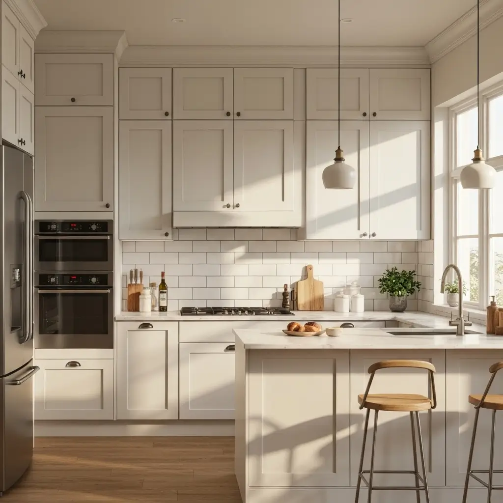
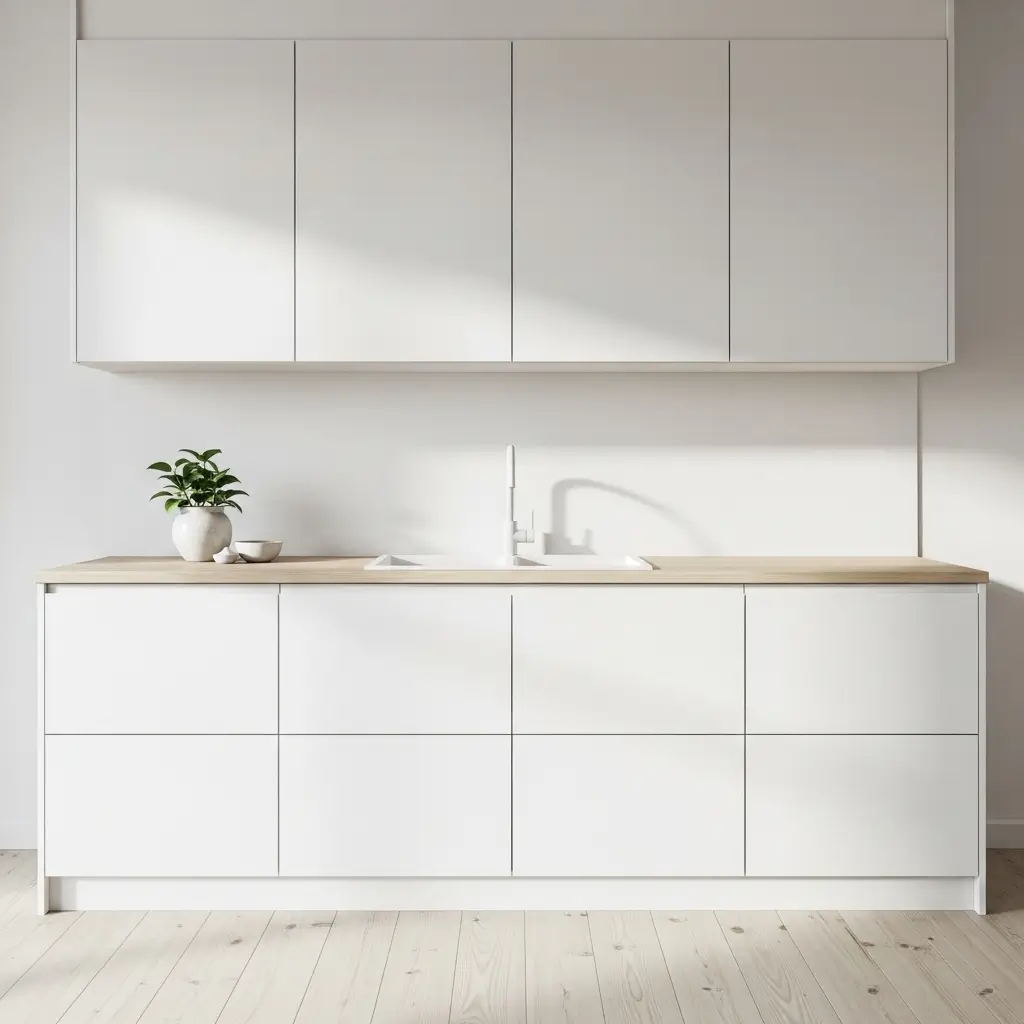
7. White-on-White Backsplash — Texture Over Color
The white-on-white kitchen backsplash against white cabinets is the most misunderstood approach in this guide, because it sounds like an absence of design rather than a design decision. It is, in fact, one of the most demanding and potentially most beautiful backsplash choices — but only when it’s executed with genuine attention to texture, finish, and proportion.
In a monochromatic white kitchen, texture becomes the entire design vocabulary. Matte white tile against glossy white cabinet doors. Textured three-dimensional white tile against smooth white countertop. Handmade white ceramic with irregular surface against precision-cut white cabinet faces. These combinations create depth and interest that color would obscure rather than reveal. The eye, denied color to track, begins to notice material quality and surface variation in a way that color-rich kitchens don’t invite.
The result, when it works, is a kitchen of exceptional quietness and sophistication. The kind of room that looks calm and almost effortless in a way that kitchens with complex palettes cannot achieve.
Texture Combinations for White-on-White Backsplashes
- Matte white large-format tile against gloss white flat-panel cabinets — finish contrast creates depth without color
- Three-dimensional white tile (wave, fluted, or faceted) against smooth white cabinetry — shadow and light create the design
- Handmade white ceramic subway tile against factory-finished white shaker doors — craft against precision
- White micro-mosaic tile against white cabinets — the repetition of small tiles creates texture through pattern
- White zellige against white cabinets — shimmer and variation without color, the most refined monochromatic choice
8. Terracotta Tile Backsplash — Warm Earth Against White
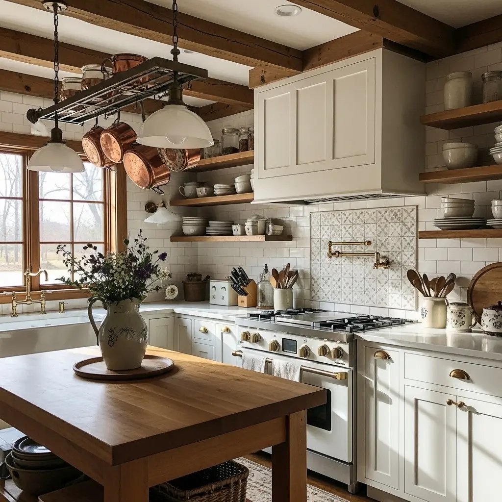
Terracotta and white is an ancient combination. Every whitewashed farmhouse in the Mediterranean has been using it for centuries. There’s a reason it keeps reappearing in contemporary kitchen design: the warm, reddish-brown earth tones of terracotta against white create a combination that feels genuinely alive and warm in a way that cooler color pairings don’t.
Modern terracotta backsplash tiles come in a range of formats — from small hexagons that create a mosaic-like surface, to medium square tiles in the traditional Spanish format, to larger rectangles in a contemporary profile. The surface variation of genuine terracotta (as opposed to porcelain terracotta-look) is part of the appeal: slight color variation between tiles, irregular edges in some formats, and a matte, slightly porous surface that absorbs light rather than reflecting it.
Terracotta Format and Finish Options for White Cabinet Kitchens
- Small hexagon terracotta — creates a mosaic floor-tile-on-the-wall effect; playful and warm
- 4×4-inch square terracotta in the traditional Spanish format — authentic, warm, farmhouse-appropriate
- Large rectangular terracotta in a brick pattern — more contemporary scale; bridges traditional and modern
- Glazed terracotta in a red-orange or warm brown — adds color depth and slight reflectivity to the matte terracotta tone
- Terracotta-look porcelain — if you want the look without the porosity; more consistent color, less character
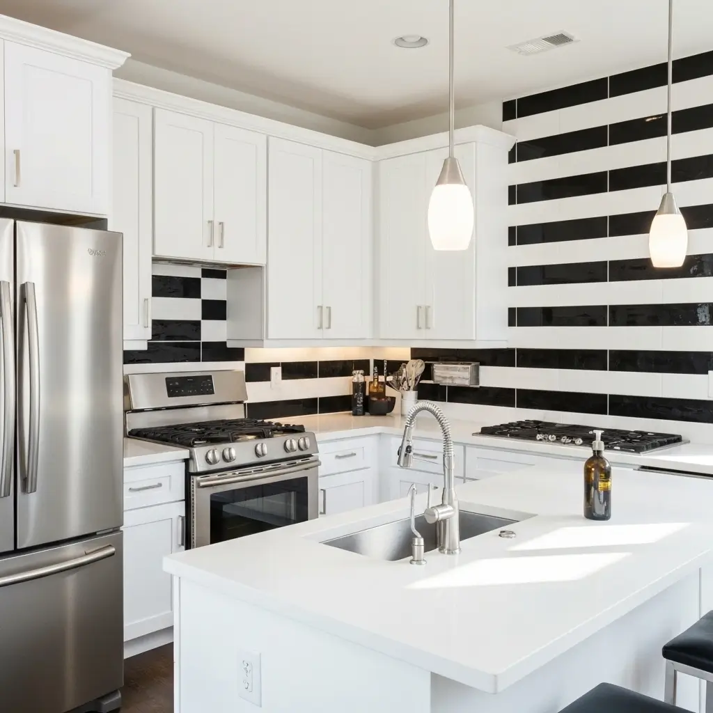
9. Black Backsplash with White Cabinets — Maximum Contrast
A black backsplash behind white cabinets is the highest-contrast option available, and in the right kitchen, it creates something genuinely dramatic. The white cabinets and black backsplash create a graphic, architectural quality that makes the kitchen feel designed in a way that more neutral combinations sometimes don’t. Every element becomes more defined. The countertop reads differently against a black wall than against white. The cabinet hardware pops. The pendant lights cast shadows that become part of the composition.
The most important consideration with a black backsplash is the finish. Matte black tile creates a surface that absorbs light, adding depth and mystery but potentially making the kitchen feel darker. Glossy black tile reflects light, maintaining brightness while still providing the full contrast impact. For kitchens with strong natural light, matte black works beautifully. For kitchens with less natural light, glossy black is the more practical choice.
Black Backsplash Tile Options for White Cabinets
- Matte black large-format porcelain — the most modern and architectural choice; absorbs light, adds depth
- Black zellige — matte but with surface variation and shimmer; the most textural black option
- Glossy black subway tile with white grout — graphic, clean, the reverse of the classic white subway tile look
- Black slate or slate-look porcelain — natural material variation; organic rather than manufactured-feeling
- Black penny round mosaic — unexpected scale creates a surface that reads as texture rather than just color
Pro Tip: A black backsplash against white cabinets creates strong visual contrast that makes grout lines very visible. Use black grout with black tile (not white or gray) to maintain the drama of the surface rather than creating a grid of contrasting lines across the wall.
10. Herringbone Pattern Backsplash — Movement and Elegance
The herringbone pattern — where rectangular tiles are laid at 90-degree angles to each other, creating a repeating V or zigzag across the surface — adds movement and visual energy to a backsplash that a standard brick-lay or stack pattern simply doesn’t provide. It reads as more formal and considered than other tile layouts, which makes it particularly effective in white kitchens where it’s the pattern rather than the color that does the design work.
White subway tile in a herringbone pattern with white grout against white cabinets creates one of the most elegant and quiet backsplash combinations possible. The pattern is clearly present but not dominant. It adds texture through geometry rather than material variation. It photographs as sophisticated and is genuinely beautiful to live with over time.
Herringbone also works with materials beyond white subway tile. Marble mosaic herringbone. Natural stone herringbone in travertine or limestone. Wood-look porcelain in herringbone for a completely different material register. Each version brings different energy, but the underlying geometry reads as elegance in all of them.
Herringbone Material Combinations for White Cabinet Kitchens
- White marble mosaic herringbone — the most luxurious version; the veining in each tile creates additional visual interest
- White ceramic subway tile herringbone with dark grout — the graphic version; pattern and contrast simultaneously
- Travertine herringbone in cream and warm beige tones — warm, natural, pairs best with cream-white cabinets
- Gray porcelain herringbone — contemporary, neutral, adds pattern without color commitment
- Brass or metallic tile herringbone — the maximum glamour version; warm metal in a dynamic pattern
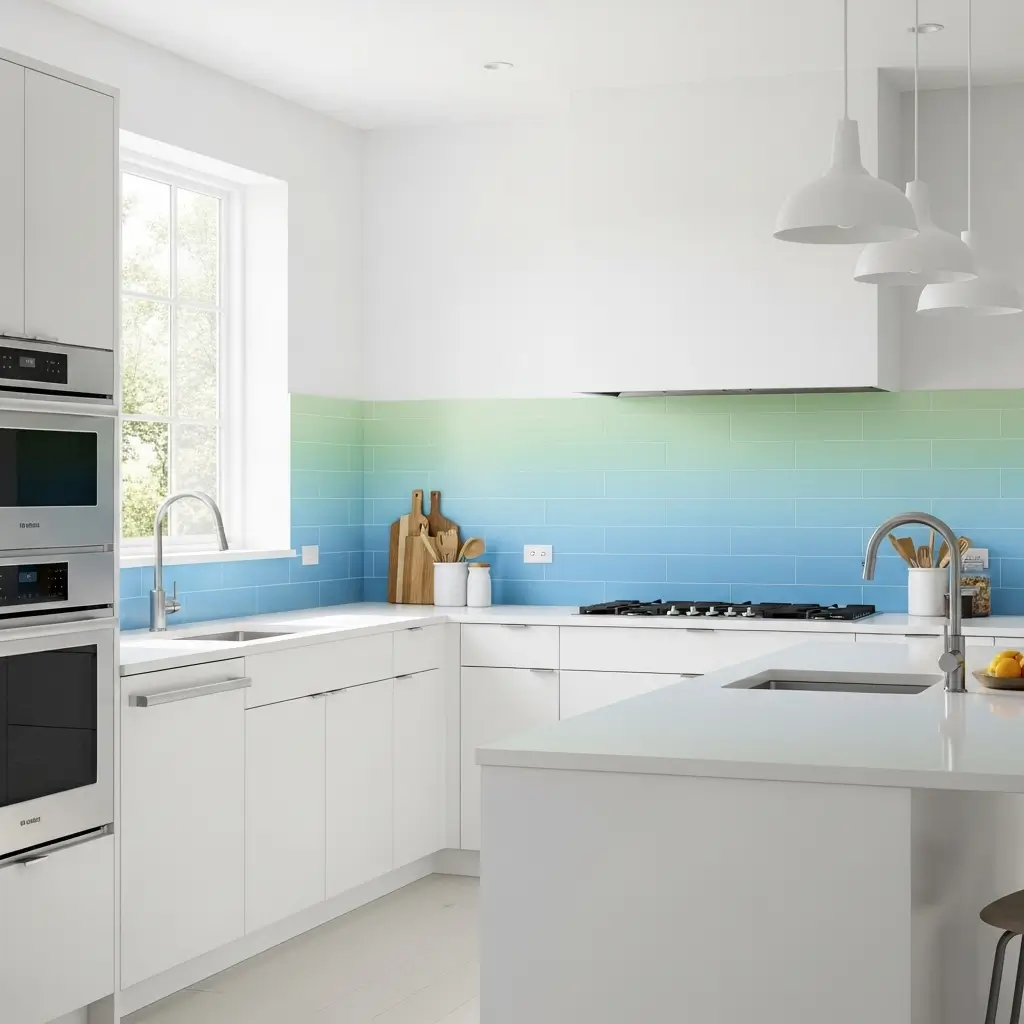
11. Glass Tile Backsplash — Light, Reflection, and Depth
Glass tile has a quality no other tile material replicates: genuine translucency. Light enters the tile, reflects off the backing, and exits through the face, creating a depth and luminosity that opaque tile simply cannot achieve. In a kitchen where white cabinets are already maximizing light reflection, a glass tile backsplash amplifies the brightness of the room beyond what either material achieves alone.
The color range in glass tile is extraordinary — from ice-clear with no color to saturated colors with full transparency, the entire visible spectrum is available in glass tile. Sea-glass inspired blues and greens have been popular for years precisely because the translucency of the glass creates color depth that ceramic or porcelain versions of the same shade don’t deliver.
Glass Tile Types for White Cabinet Backsplashes
- Clear glass subway tile with a white backing — luminous and bright; the backing color creates the appearance color
- Sea glass-inspired blues and greens — coastal, fresh, the translucency creates color depth that opaque tile can’t match
- Iridescent glass tile — shifts color with the angle of light; magical, somewhat theatrical
- Frosted glass tile — diffuses rather than reflects; softer, quieter than clear glass, easier to style around
- Recycled glass tile in muted colors — sustainable, varied, beautiful matte surface with ecological credentials
12. Fluted or Ribbed Tile Backsplash — Three-Dimensional Texture
Fluted and ribbed tile surfaces are one of the most significant backsplash trends of the past three years, and they’re earning their longevity for a real design reason: three-dimensional texture in a backsplash does something that flat tile cannot. It creates shadow lines that shift throughout the day as light angles change. The wall reads as alive rather than static. And in a white kitchen where color isn’t available to create interest, texture becomes the primary design tool.
White fluted tile against white cabinets is particularly effective because the shadows in the channels provide contrast against the bright cabinet faces without introducing color. The effect is simultaneously quiet and visually rich — a combination that’s harder to achieve than it sounds.
Fluted tile is available in ceramic, porcelain, glass, and natural stone. Ceramic fluted tile in white or cream is the most accessible option. Stone fluted tile in marble or travertine is the most luxurious. The profile of the ridges varies from tight and fine (almost fabric-like texture) to bold and deep (strong shadow lines even in low light).
Fluted and Ribbed Tile Options for White Kitchens
- White ceramic fluted tile in a fine profile — subtle texture, quiet design, works in minimal and traditional kitchens
- White porcelain ribbed tile in a bold profile — strong shadow lines, more dramatic, best in kitchens with good natural light
- Marble fluted tile — the luxury version; each tile shows grain variation within the ribbed surface
- Colored fluted tile (sage green, terracotta, navy) — color and texture simultaneously; more commitment, more reward
- Glass fluted tile — combines the translucency of glass with three-dimensional texture; luminous and textural simultaneously
13. Moroccan or Encaustic Cement Tile Patterns
Encaustic cement tiles — handmade tiles in which the pattern is created by pouring differently colored cement into a mold rather than printed onto a surface — bring a level of artisanal character to a white kitchen that no manufactured tile can match. The pattern is literally embedded in the material, which means it can’t chip away from a surface as a glaze can. It becomes more beautiful with age and gentle polishing.
Against white cabinets, a patterned cement tile backsplash becomes the entire personality of the kitchen. The white cabinetry doesn’t compete — it frames. The tile is the art; the cabinets are the gallery wall. This is one of the few backsplash choices that actively benefits from white cabinets being as plain and simple as possible. The more minimal the cabinet hardware and profile, the more the pattern tile gets to speak.
Cement Tile Pattern and Color Considerations
- Blue and white geometric Moroccan patterns — the classic; Andalusian and Mediterranean character with maximum drama
- Black and white geometric patterns — graphic and striking; the most contemporary reading of the cement tile tradition
- Terracotta and cream patterns — warm, earthy, farmhouse-appropriate; pairs with cream-white rather than bright-white cabinets
- Sage green and white patterns — the organic choice; botanical and fresh
- Single-color solid cement tile with texture — all the material quality of cement without the pattern commitment
Pro Tip: Cement tiles are porous and must be sealed before grouting and again after installation. Failure to seal properly results in grout permanently staining the tile surface. Use a penetrating sealer specifically designed for cement tile, and apply it before any contact with grout.
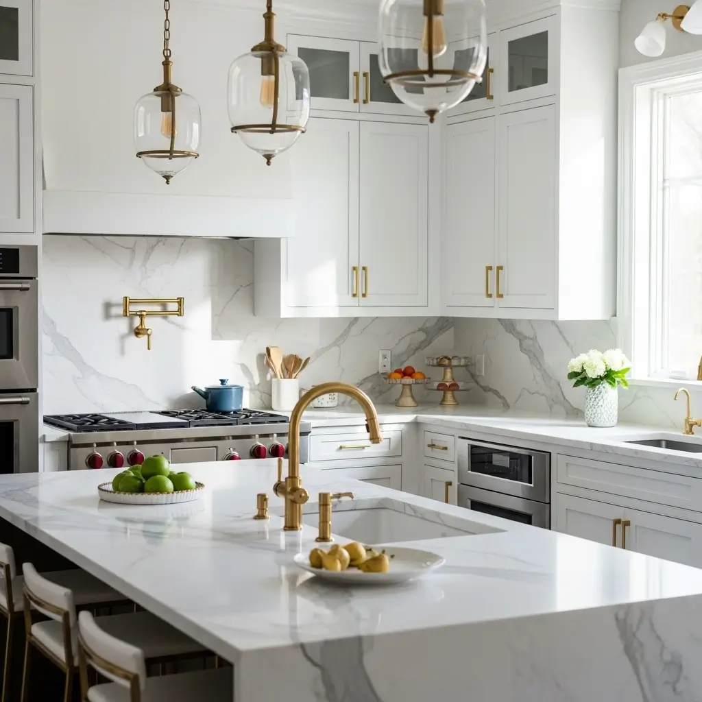
14. Brass and Metallic Tile Backsplash — Warmth and Glamour
Metallic tile backsplashes occupy a specific and very effective design position in white cabinet kitchens. The warmth of brass, copper, or gold tile against white cabinets creates a combination that reads as luxurious without the maintenance demands of natural stone. The metallic surface reflects light in a way that adds warmth to the white of the cabinets and creates a kitchen that glows rather than simply being bright.
Brass tile in particular has benefited from the same broader design renaissance as brass hardware. Antique brass, brushed brass, and unlacquered brass tile all create different visual temperatures against white. Antique brass is warmest and most patinated. Brushed brass is more restrained and contemporary. Unlacquered brass is the most dynamic — it evolves over time, which either delights or concerns depending on your relationship with materials that change.
Metallic Backsplash Materials for White Cabinet Kitchens
- Brushed brass subway tile — warm, contemporary, pairs brilliantly with white shaker cabinets and stone countertops
- Antique copper tile — the most rustic and warm metallic option; farmhouse and industrial aesthetics
- Stainless steel tile — the commercial kitchen reference; pairs with professional-grade appliances and industrial design elements
- Gold mirror tile mosaic — the maximum glamour choice; small format gold mirror tiles create extraordinary light reflection
- Metallic glazed ceramic — a ceramic tile with a metallic glaze finish; more affordable than actual metal tile, similar visual effect
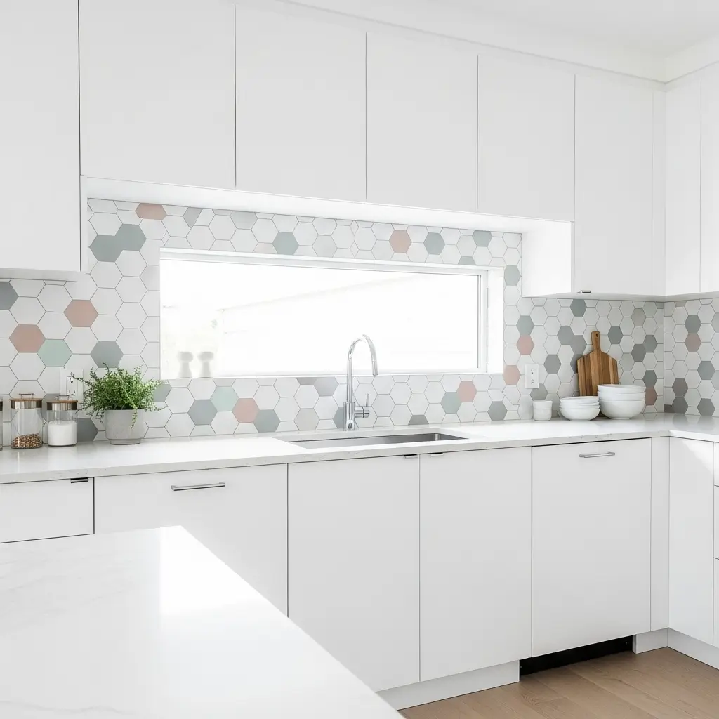
15. Hexagon Tile Backsplash — Geometric Warmth
The hexagon tile has been part of kitchen and bathroom design for well over a century — it appeared in early 20th-century American bathrooms as floor tile and never quite left the design vocabulary. Its current popularity in backsplash applications against white cabinets is partly nostalgic and partly genuinely contemporary: the six-sided shape creates a geometric pattern that is both mathematical and organic, referencing honeycomb, basalt columns, and other natural geometric structures.
White hexagon tile against white cabinets in a tight mosaic (1-2 inch hexagons) creates a surface that reads as texture from a distance and reveals its pattern only when examined up close. Larger hexagons (4-6 inches) read as a clear geometric pattern from across the room. Both scales work with white cabinets, but they create distinctly different kitchen characters.
Hexagon Tile Options for White Cabinet Backsplashes
- Small white hexagon mosaic with white grout — all-white surface with subtle pattern; minimal and refined
- Small white hexagon with black grout — the graphic version; the pattern reads clearly and adds significant visual energy
- Large white porcelain hexagon — contemporary and architectural; the scale makes the geometry impossible to miss
- Colored hexagon mosaic (navy, sage, terracotta) in a white field — color as accent within the pattern
- Marble hexagon in varied sizes — luxurious, organic, the variation in stone within each tile adds depth to the geometric pattern
The Practical Backsplash Decision Guide
How to Choose a Backsplash for White Cabinets
The single most useful framework for choosing a backsplash for white cabinets is to decide, first, whether you want the backsplash to be a neutral field or a statement element. This is not an aesthetic preference — it’s a structural design decision that determines everything that follows.
A neutral-field backsplash supports the kitchen’s other elements without competing with them. It gives the countertop, the hardware, the flooring, and the lighting the visual space to do their work. White-on-white, marble-look porcelain, large-format slab, and light stone are all neutral-field choices. They reward complex, layered kitchens where many elements are contributing to the overall design.
A statement backsplash becomes the focal point of the kitchen and asks everything else to step back. Bold color tile, patterned cement tile, hand-painted artisan tile, and dramatic natural stone are all statement choices. They reward kitchens with simple, restrained cabinet and hardware profiles — white shaker cabinets with minimal hardware, for example — where the simplicity of the surroundings allows the backsplash to be clearly the star.
Grout: The Detail That Changes Everything
Grout is the most underestimated decision in backsplash installation. The same white subway tile with different grout colors produces kitchens that look and feel completely different. The grout color determines how visible the tile grid is, which affects how the surface reads from across the room.
Light grout (white, off-white, light gray) creates a near-seamless surface. The tile grid is present but subordinate to the overall material appearance. Dark grout (charcoal, dark gray, black) makes the tile grid graphic and intentional. The pattern of the tile layout becomes clearly visible and contributes actively to the design.
As a general rule: if your tile has strong pattern or color, use light grout so the grout doesn’t compete. If your tile is simple (white subway, basic ceramic), dark grout gives the installation visual interest and definition it wouldn’t otherwise have.
Backsplash Coverage: How High Is Enough?
Standard backsplash coverage runs from countertop to the bottom of the upper cabinets — typically 18 inches. This is the functional minimum and often the design minimum. But extending the backsplash above the upper cabinets to the ceiling, particularly in the area above the range or on a single focal-point wall, is one of the most impactful and underutilized opportunities in kitchen backsplash design.
A full-height backsplash from countertop to ceiling on the cooking wall makes the range area a genuine focal point. It also simplifies the wall treatment decision — rather than choosing a paint color for the upper wall section, you bring the tile or stone all the way up. In a white cabinet kitchen, this creates a clean, hotel-quality finish that looks as though the kitchen was designed by a professional rather than assembled from separate decisions.
Budget and Material Reality
Backsplash costs vary enormously depending on material, tile format, and installation complexity. Here’s an honest range for standard backsplash coverage (approximately 30 square feet) in materials only, not including installation:
Standard ceramic tile: $100–$400. Porcelain tile: $200–$800. Glass tile: $300–$1,200. Natural stone tile: $400–$1,500. Zellige handmade tile: $500–$2,000. Natural stone slab: $800–$3,000 including fabrication. Hand-painted artisan tile: $600–$3,000+ depending on design complexity.
Installation adds 30–60% on top of material costs for standard tile, more for complex patterns (herringbone, mosaic, large format). The single best investment in backsplash installation is a skilled tile setter with experience in your specific material type. An excellent installer makes good tile look extraordinary. A poor installer makes expensive tile look mediocre.
Conclusion: Your Backsplash, Your Kitchen’s Personality
White cabinets are genuinely generous. They will go along with almost any backsplash you choose, support almost any style direction you take, and accommodate almost any color, material, or pattern you bring to them. That generosity is a gift.
But gifts require decisions. The blank canvas of white cabinetry eventually needs something on the wall behind it, and that something will define the personality of your kitchen more than any other single design choice you make. More than the countertop. More than the hardware. More than the flooring. Because the backsplash is the vertical surface at eye level — the surface you look at every time you stand at the sink, the stove, or the counter. You see it more than anything else in the room.
The 23 ideas in this guide cover the full range of what’s possible — from the quiet restraint of white-on-white zellige to the bold drama of a full cobalt blue Moroccan tile wall. From the luxury of book-matched marble slab to the artisanal warmth of hand-painted Portuguese azulejo. From the contemporary clarity of fluted white porcelain to the vintage nostalgia of penny round mosaic with black grout.
Pick the one that fits not just your kitchen’s style but the way you want to feel when you walk into that room every morning. The backsplash is where the kitchen’s personality lives. Make sure it’s yours.
1 thought on “15 Gorgeous Kitchen Backsplash with White Cabinets Ideas for Style”